
#DB8764 Hex Color
Online color picker to view shades, tints, color codes, and complementary colors
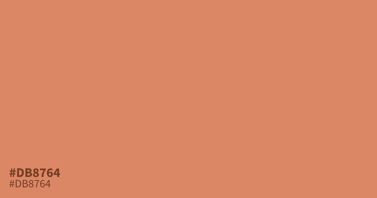
Pastel orange with a dusty terracotta undertone. The muted saturation keeps #db8764 mellow, so treat it as a supporting tone or background rather than the star of a palette. Deep navy makes it read warmer and richer. Black text sits at about 7.7:1 contrast, enough for small body copy. For a calmer scheme, balance it with neutrals; what colors make gray covers the basics.
Questions about #db8764
What is #db8764 in RGB, HSL and CMYK?
In RGB, #db8764 is rgb(219, 135, 100), in HSL hsl(18, 62%, 63%) and in CMYK 0%, 38%, 54%, 14%. Browse more shades of orange with names and hex codes.
What colors pair well with #db8764?
Deep navy and forest green make #db8764 read warmer and richer, while cream keeps it soft. Pale yellows tend to wash out its undertones. Charcoal also grounds it nicely in autumn palettes.
Where does #db8764 work best in design?
It shines as a background in spring and autumn themes, baby products, and food packaging. The muted tone also suits youth marketing where a bright orange would feel too loud.
Is #db8764 readable on white or black?
#db8764 has a 2.74:1 contrast ratio on white and 7.66:1 on black. WCAG asks for 4.5:1 for body text and 3:1 for large text, so on white it is too faint for text and on black it works for body text. Try other pairs in the contrast checker.