
#DB2248 Hex Color
A demanding crimson red with high saturation
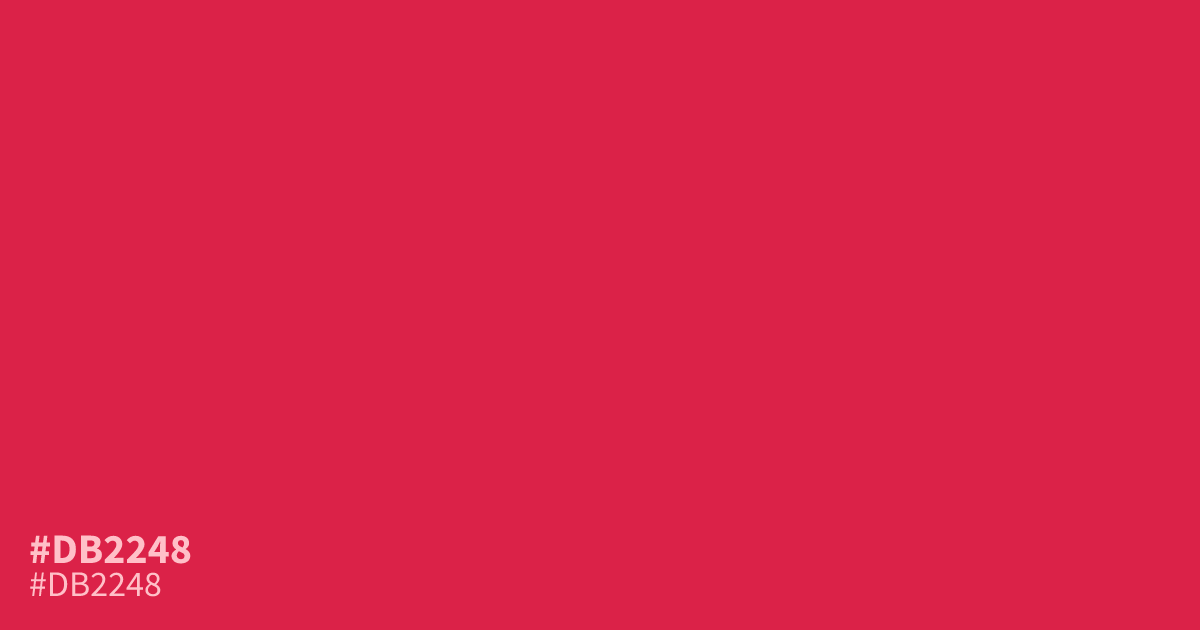
This high-intensity red commands attention with its aggressive saturation. Because #db2248 is so demanding, use it sparingly as a 10% accent color rather than a primary background. It pairs surprisingly well with deep forest greens or cool charcoals. While white text remains legible against this hex code, avoid using it for large blocks of copy as the intensity can cause eye strain.
Questions about #db2248
What is #db2248 in RGB, HSL and CMYK?
In RGB, #db2248 is rgb(219, 34, 72), in HSL hsl(348, 73%, 50%) and in CMYK 0%, 84%, 67%, 14%. Browse more shades of red with names and hex codes.
How can #db2248 be used effectively?
Use #db2248 sparingly as a ten percent accent color to draw attention to call-to-action buttons or small visual elements. Because the saturation level is so high, it overwhelms backgrounds and causes significant eye strain if applied to large areas of text or UI blocks.
Which colors pair well with #db2248?
Pair #db2248 with deep forest green or cool charcoal to balance its intense, aggressive energy. These grounding neutrals allow the vibrancy of this red to pop without clashing or making the overall design feel too chaotic or visually fatiguing for the viewer.
Is #db2248 readable on white or black?
#db2248 has a 4.84:1 contrast ratio on white and 4.33:1 on black. WCAG asks for 4.5:1 for body text and 3:1 for large text, so on white it works for body text and on black it works only for large text (24px, or 18.5px bold). Try other pairs in the contrast checker.