
#DA607E Hex Color
Online color picker to view shades, tints, color codes, and complementary colors
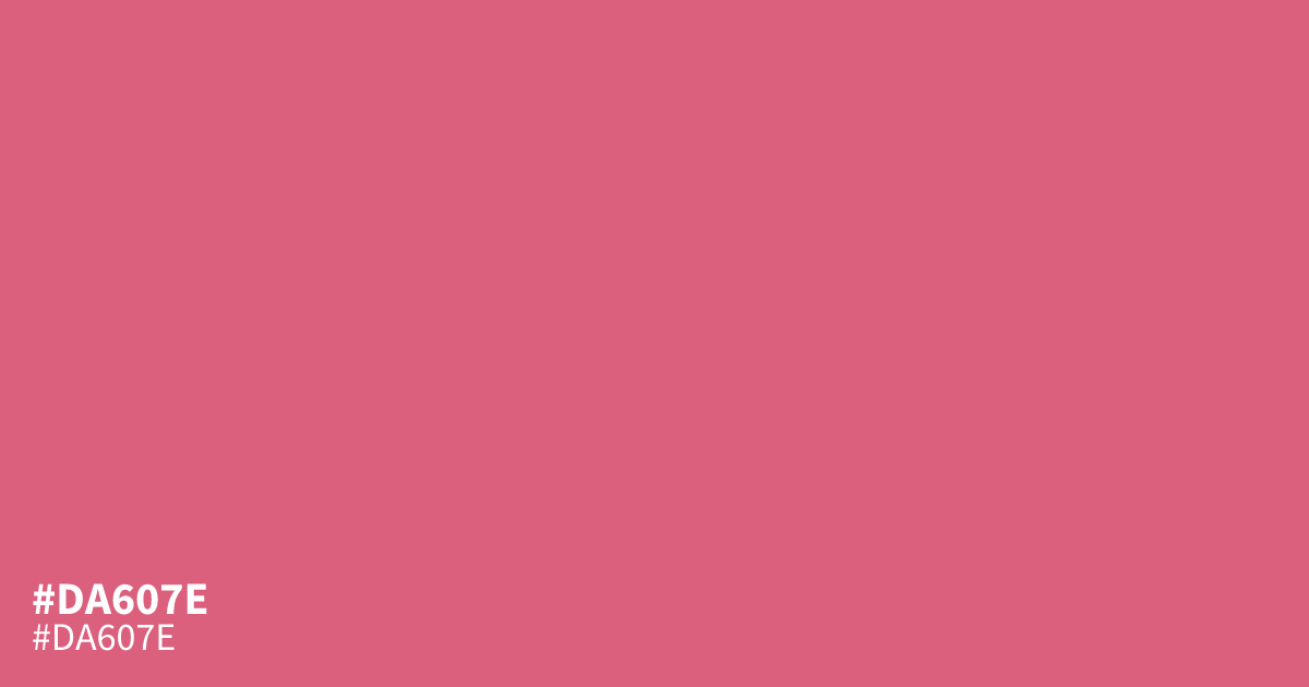
Bold raspberry pink with real warmth. #da607e is saturated enough to command attention yet mellow enough to carry a dominant role in cosmetics, confectionery, or nightlife branding. Black text reads clearly on it at about 6.0:1 contrast, so it passes AA behind small type. Watch large flat fills, which can turn muddy. Pair it with deep plum or navy instead of white for richer contrast. The hex code #da607e sits right between red and pink.
Questions about #da607e
What is #da607e in RGB, HSL and CMYK?
In RGB, #da607e is rgb(218, 96, 126), in HSL hsl(345, 62%, 62%) and in CMYK 0%, 56%, 42%, 15%. Browse more shades of pink with names and hex codes.
Does black or white text work better on #da607e?
Black text works better. It reaches roughly 6.0:1 contrast, which passes WCAG AA for small body text, while white falls short and reads washed out on this shade.
What colors pair well with #da607e?
Deep plum, navy, and cream flatter #da607e more than white does, keeping its warmth from turning muddy. Use it as an accent against those darker tones for the strongest result.
Is #da607e readable on white or black?
#da607e has a 3.52:1 contrast ratio on white and 5.95:1 on black. WCAG asks for 4.5:1 for body text and 3:1 for large text, so on white it works only for large text (24px, or 18.5px bold) and on black it works for body text. Try other pairs in the contrast checker.