
#DA1B7A Hex Color
Online color picker to view shades, tints, color codes, and complementary colors
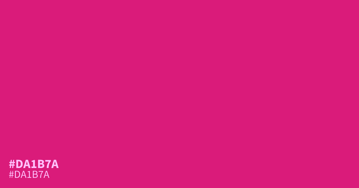
This saturated, intense pink demands attention. It is loud and beaming, functioning best as a high-energy accent rather than a background color. Because it is so vivid, it pairs surprisingly well with deep, cool charcoals or slate blues to ground its inherent sweetness. Accessibility is solid for white text, which reads clearly against this hex code, #da1b7a. Use it sparingly to inject pop culture excitement into your designs.
Questions about #da1b7a
What is #da1b7a in RGB, HSL and CMYK?
In RGB, #da1b7a is rgb(218, 27, 122), in HSL hsl(330, 78%, 48%) and in CMYK 0%, 88%, 44%, 15%. Browse more shades of pink with names and hex codes.
What colors pair best with #da1b7a to balance its intensity?
This vibrant pink balances best when paired with deep, cool tones like charcoal or slate blue, which act as a neutral anchor for its brightness. Avoiding other high-energy colors prevents visual clutter, allowing the pink to serve as a clean, intentional pop.
Is #da1b7a suitable for text on a white background?
Yes, #da1b7a provides sufficient contrast against white backgrounds, making it a reliable choice for buttons or bold typography. It remains readable at larger font sizes, though it should be used sparingly to avoid overwhelming the user with its high saturation.
Is #da1b7a readable on white or black?
#da1b7a has a 4.75:1 contrast ratio on white and 4.41:1 on black. WCAG asks for 4.5:1 for body text and 3:1 for large text, so on white it works for body text and on black it works only for large text (24px, or 18.5px bold). Try other pairs in the contrast checker.