
#D8BCE6 Hex Color
Online color picker to view shades, tints, color codes, and complementary colors
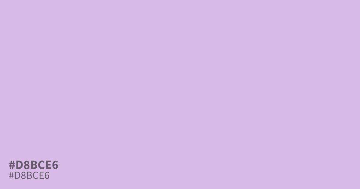
#d8bce6 is a dusty, unsaturated violet with a cool, airy character. It works best as a background because it provides excellent contrast for black type. Designers often pair this shade with deep charcoal or slate greys to anchor its softness. Avoid using it alongside stark white, as it can appear washed out. This hex code provides a refined aesthetic for wellness branding and UI design.
Questions about #d8bce6
What is #d8bce6 in RGB, HSL and CMYK?
In RGB, #d8bce6 is rgb(216, 188, 230), in HSL hsl(280, 46%, 82%) and in CMYK 6%, 18%, 0%, 10%. Browse more shades of purple with names and hex codes.
What colors complement #d8bce6 in a design palette?
This dusty violet shines when grounded by dark, neutral tones like charcoal or slate. Using it against deep, dark text provides the necessary contrast that prevents the color from appearing washed out or flat in your interface.
Why should I avoid using white with #d8bce6?
Placing #d8bce6 directly against stark white often causes it to lose its saturation, making the violet appear faded or indistinct. A darker neutral background or text color ensures the subtle, cool qualities of the shade remain fully visible.
Is #d8bce6 readable on white or black?
#d8bce6 has a 1.71:1 contrast ratio on white and 12.25:1 on black. WCAG asks for 4.5:1 for body text and 3:1 for large text, so on white it is too faint for text and on black it works for body text. Try other pairs in the contrast checker.