
#D89F8C Hex Color
Online color picker to view shades, tints, color codes, and complementary colors
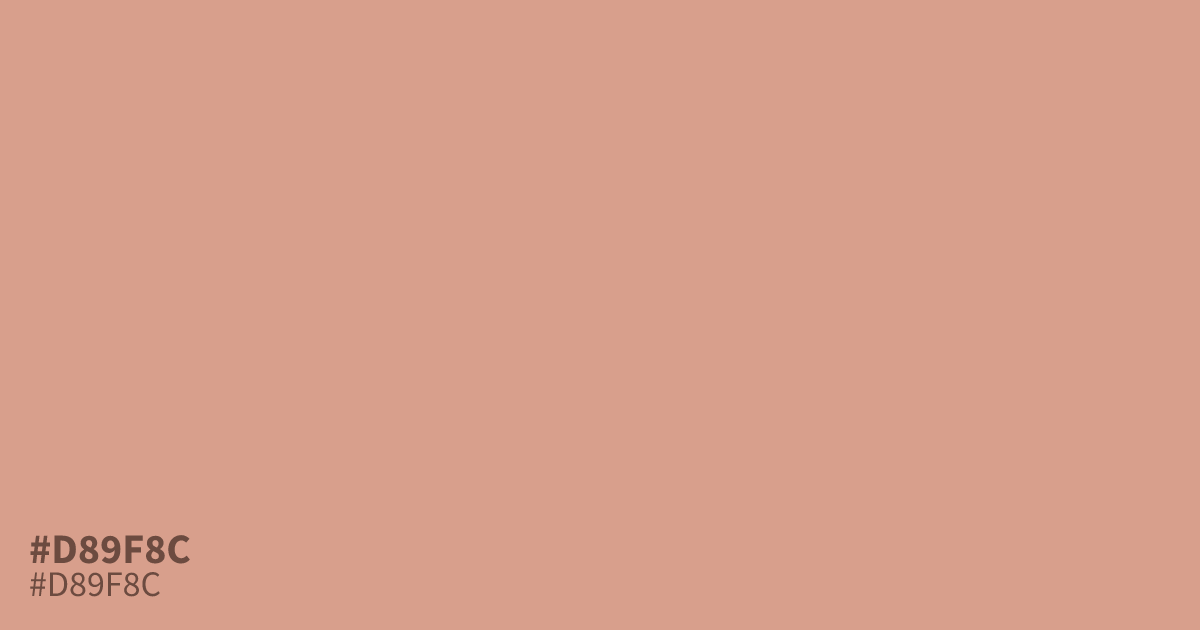
This dusty, unsaturated terra cotta lands on the soft side of red. With its distinct ashy undertone, #d89f8c acts as a sophisticated neutral rather than a loud pop of color. It pairs beautifully with deep charcoal grays or forest greens to anchor a design. Use it as a secondary or accent color, as it can feel too muted for large text blocks.
Questions about #d89f8c
What is #d89f8c in RGB, HSL and CMYK?
In RGB, #d89f8c is rgb(216, 159, 140), in HSL hsl(15, 49%, 70%) and in CMYK 0%, 26%, 35%, 15%. Browse more shades of pink with names and hex codes.
What colors pair best with #d89f8c?
#d89f8c works beautifully when paired with charcoal or forest green to ground its soft warmth. These darker, cool-toned neutrals create a balanced contrast that prevents the muted red from feeling washed out or overly feminine in professional designs.
Is #d89f8c suitable for large text blocks?
Using #d89f8c for large text blocks is generally not recommended as it lacks the high contrast needed for comfortable readability against most backgrounds. It functions best as an accent or secondary element where its muted character adds subtle warmth without straining the viewer's eyes.
Is #d89f8c readable on white or black?
#d89f8c has a 2.26:1 contrast ratio on white and 9.25:1 on black. WCAG asks for 4.5:1 for body text and 3:1 for large text, so on white it is too faint for text and on black it works for body text. Try other pairs in the contrast checker.