
#D7B190 Hex Color
Online color picker to view shades, tints, color codes, and complementary colors
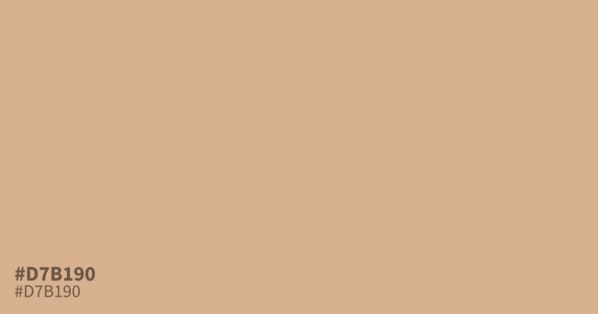
Reach for #d7b190 when a design needs a warm neutral with more personality than beige. This dusty pastel orange sits low in saturation, so it reads mellow rather than loud, with a soft tan undertone that suits spring packaging, baby products, and autumn backgrounds. Black text passes WCAG AA on it at about 10.6:1 contrast. Use it as a dominant base with deeper terracotta accents, since large areas can look flat on their own.
Questions about #d7b190
What is #d7b190 in RGB, HSL and CMYK?
In RGB, #d7b190 is rgb(215, 177, 144), in HSL hsl(28, 47%, 70%) and in CMYK 0%, 18%, 33%, 16%. Browse more shades of brown with names and hex codes.
What colors pair well with #d7b190?
Deeper terracotta and olive green ground #d7b190 and stop it from washing out. For text and UI elements, dark brown or charcoal both sit comfortably on top of it.
What mood does #d7b190 convey?
The low saturation and lightness give it a gentle, optimistic feel, closer to a soft autumn tan than a bright orange. It reads friendly and youthful without demanding attention.
Is #d7b190 readable on white or black?
#d7b190 has a 1.98:1 contrast ratio on white and 10.58:1 on black. WCAG asks for 4.5:1 for body text and 3:1 for large text, so on white it is too faint for text and on black it works for body text. Try other pairs in the contrast checker.