
#D7A692 Hex Color
Online color picker to view shades, tints, color codes, and complementary colors
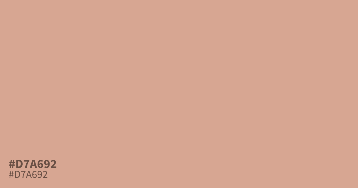
A dusty, pastel orange with a soft gray undertone. #d7a692 reads warm but muted, closer to clay than peach, and works best as a gentle background or supporting tone. It flatters deep accents like burgundy or charcoal text, which pass contrast checks against its light surface. At large sizes it can feel washed out next to white, so pair it with darker neutrals.
Questions about #d7a692
What is #d7a692 in RGB, HSL and CMYK?
In RGB, #d7a692 is rgb(215, 166, 146), in HSL hsl(17, 46%, 71%) and in CMYK 0%, 23%, 32%, 16%. Browse more shades of brown with names and hex codes.
Does #d7a692 read warm or cool?
#d7a692 reads warm. Its orange base sits in the red-yellow range, and the muted gray undertone only softens the warmth rather than canceling it out.
What text color works best on #d7a692?
Black text on #d7a692 gives a contrast ratio of about 9.8:1, which clears WCAG AA for body text. White text falls well below the 4.5:1 threshold and should be avoided for small type.
What pairs well with #d7a692?
Is #d7a692 readable on white or black?
#d7a692 has a 2.15:1 contrast ratio on white and 9.75:1 on black. WCAG asks for 4.5:1 for body text and 3:1 for large text, so on white it is too faint for text and on black it works for body text. Try other pairs in the contrast checker.