
#D6A382 Hex Color
Online color picker to view shades, tints, color codes, and complementary colors
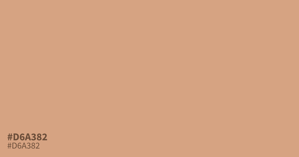
This dusty, unsaturated orange carries a warm, mellow tone reminiscent of clay or soft autumn light. Because it offers high contrast with black text, #d6a382 functions well as a readable background or a gentle base for neutral layouts. Avoid using it alongside stark whites, as the color can appear washed out, but it pairs beautifully with deep charcoal grays to create a grounded, modern aesthetic.
Questions about #d6a382
What is #d6a382 in RGB, HSL and CMYK?
In RGB, #d6a382 is rgb(214, 163, 130), in HSL hsl(24, 51%, 67%) and in CMYK 0%, 24%, 39%, 16%. Browse more shades of brown with names and hex codes.
What colors pair well with #d6a382?
#d6a382 works best when grounded by deep neutrals like charcoal or dark brown to maintain visual weight. Because it is a soft, unsaturated tone, it can appear washed out against high-contrast white, so use it as an accent or background color alongside darker, solid elements.
Is #d6a382 suitable for text on websites?
#d6a382 generally lacks sufficient contrast for small or body text against most backgrounds, which may fail accessibility standards. Reserve this color for decorative shapes, backgrounds, or large headings where contrast requirements are less strict, or pair it with dark typography to ensure readability.
Is #d6a382 readable on white or black?
#d6a382 has a 2.22:1 contrast ratio on white and 9.42:1 on black. WCAG asks for 4.5:1 for body text and 3:1 for large text, so on white it is too faint for text and on black it works for body text. Try other pairs in the contrast checker.