
#D5A2B2 Hex Color
Online color picker to view shades, tints, color codes, and complementary colors
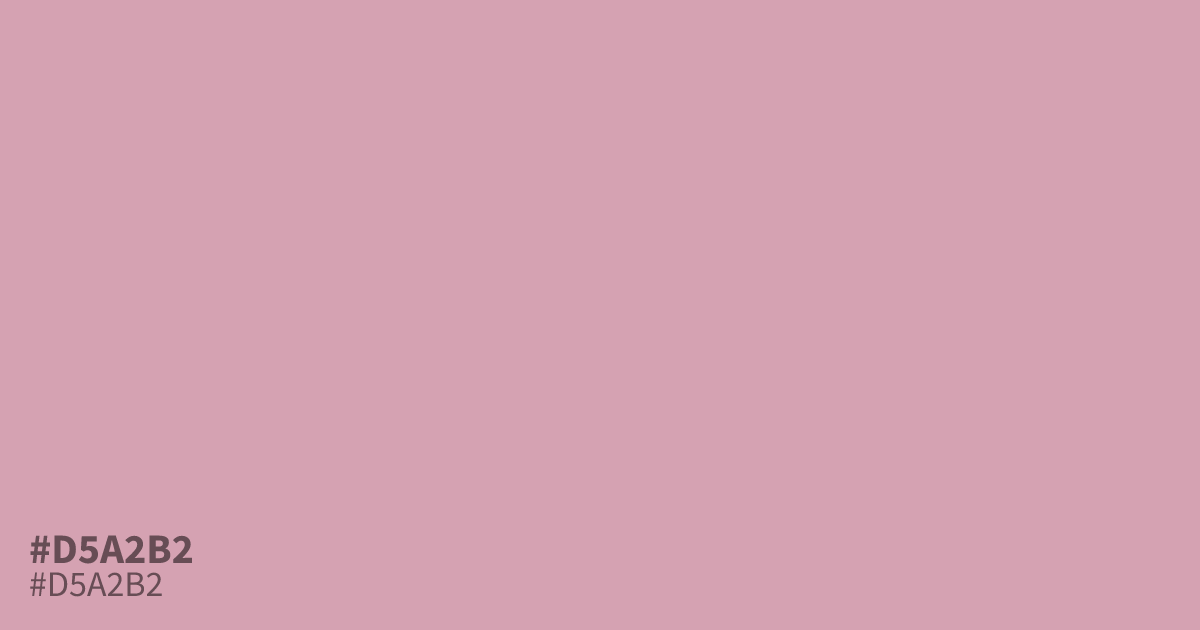
Dusty pink with a gray undertone and very little saturation, #d5a2b2 reads mellow and warm rather than sweet. Its lightness makes black text easy to read on top (about 9.6:1 contrast), so it works as a soft background for cosmetics or spring branding. Pair it with deep plum or olive to keep it from washing out next to white.
Questions about #d5a2b2
What is #d5a2b2 in RGB, HSL and CMYK?
In RGB, #d5a2b2 is rgb(213, 162, 178), in HSL hsl(341, 38%, 74%) and in CMYK 0%, 24%, 16%, 16%. Browse more shades of pink with names and hex codes.
What colors pair well with #d5a2b2?
Deep plum, olive, and charcoal all ground #d5a2b2 without fighting its muted warmth. Avoid pale neutrals nearby, since the pastel can wash out against white or cream.
Is #d5a2b2 a good background color for text?
Yes. Black text on #d5a2b2 reaches about 9.6:1 contrast, well above the WCAG AA minimum of 4.5:1, so it safely supports small body text.
Is #d5a2b2 readable on white or black?
#d5a2b2 has a 2.17:1 contrast ratio on white and 9.64:1 on black. WCAG asks for 4.5:1 for body text and 3:1 for large text, so on white it is too faint for text and on black it works for body text. Try other pairs in the contrast checker.