
#D39177 Hex Color
Online color picker to view shades, tints, color codes, and complementary colors
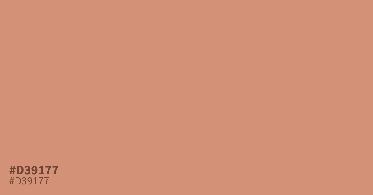
#d39177 is a pastel orange with dusty, clay-like undertones. Its low saturation and mid lightness give it a mellow warmth that suits spring layouts, baby products, and autumn palettes. It works best as a background, where black text holds about 8.1:1 contrast. Pair it with deep teal or charcoal to keep the scheme from feeling flat.
Questions about #d39177
What is #d39177 in RGB, HSL and CMYK?
In RGB, #d39177 is rgb(211, 145, 119), in HSL hsl(17, 51%, 65%) and in CMYK 0%, 31%, 44%, 17%. Browse more shades of orange with names and hex codes.
What colors pair well with #d39177?
Deep teal and navy sharpen its warmth, while cream and warm gray keep it soft. Pale yellows wash it out, so keep those away from #d39177 in a palette.
Is #d39177 readable on white or black?
#d39177 has a 2.59:1 contrast ratio on white and 8.08:1 on black. WCAG asks for 4.5:1 for body text and 3:1 for large text, so on white it is too faint for text and on black it works for body text. Try other pairs in the contrast checker.