
#D2A176 Hex Color
Online color picker to view shades, tints, color codes, and complementary colors
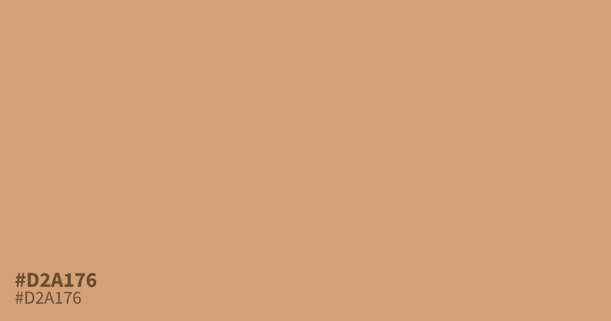
Pastel and softly muted, #d2a176 is a warm orange with peach and light brown undertones. Its mellow lightness suggests gentleness, optimism, and youthful energy without feeling loud. Use the hex code #d2a176 as a supporting tone for spring branding, food packaging, or autumn palettes, paired with charcoal or deep teal. Black text reaches about 9.1:1 contrast.
Questions about #d2a176
What is #d2a176 in RGB, HSL and CMYK?
In RGB, #d2a176 is rgb(210, 161, 118), in HSL hsl(28, 51%, 64%) and in CMYK 0%, 23%, 44%, 18%. Browse more shades of orange with names and hex codes.
What colors pair well with #d2a176?
#d2a176 pairs well with charcoal, deep teal, cream, and muted greens, balancing its warm peach-orange base with cooler or softer accents for inviting palettes that suit branding, packaging, and seasonal editorial designs.
Does #d2a176 read as warm or cool?
#d2a176 reads as warm because its orange base carries peach and light brown undertones, placing it closer to yellow-red hues on the color wheel than to cool blue or green hues. Its muted lightness keeps that warmth gentle, optimistic, and approachable rather than vivid.
Where does #d2a176 work well in a palette?
#d2a176 works well as a supporting tone in spring branding, food packaging, lifestyle layouts, and autumn palettes, especially when charcoal or deep teal adds structure and contrast to its gentle warmth.
Is #d2a176 readable on white or black?
#d2a176 has a 2.30:1 contrast ratio on white and 9.09:1 on black. WCAG asks for 4.5:1 for body text and 3:1 for large text, so on white it is too faint for text and on black it works for body text. Try other pairs in the contrast checker.