
#CB7D9E Hex Color
Online color picker to view shades, tints, color codes, and complementary colors
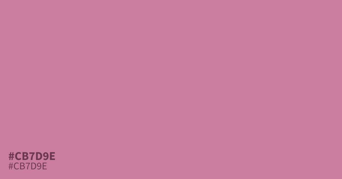
This dusty mauve sits between muted pink and soft terra-cotta. With its low saturation, #cb7d9e offers a mellow, approachable feel for branding or fashion. It pairs unexpectedly well with deep forest greens, which ground the warmth. Because it has excellent contrast against black text, it works reliably for UI elements. Use the hex code #cb7d9e as a supporting tone rather than a dominant background.
Questions about #cb7d9e
What is #cb7d9e in RGB, HSL and CMYK?
In RGB, #cb7d9e is rgb(203, 125, 158), in HSL hsl(335, 43%, 64%) and in CMYK 0%, 38%, 22%, 20%. Browse more shades of pink with names and hex codes.
Does #cb7d9e read as a warm or cool tone?
#cb7d9e leans warm due to its distinct terra-cotta undertones, which prevent it from feeling like a standard cool, purple-based mauve. This warmth makes it approachable for branding that requires a human, organic touch without appearing overly sweet or bubblegum-like.
What colors pair best with #cb7d9e for high-end design?
Is #cb7d9e readable on white or black?
#cb7d9e has a 3.01:1 contrast ratio on white and 6.96:1 on black. WCAG asks for 4.5:1 for body text and 3:1 for large text, so on white it works only for large text (24px, or 18.5px bold) and on black it works for body text. Try other pairs in the contrast checker.