
#C9A2B3 Hex Color
Online color picker to view shades, tints, color codes, and complementary colors
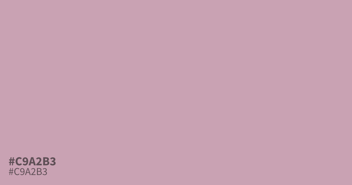
#c9a2b3 is a muted dusty pink with a soft mauve undertone and a gentle, grayed-off warmth. Its low saturation keeps it calm and powdery rather than sweet, so it reads as romantic without feeling sugary. Designers reach for it where a quiet, vintage-lean pink is needed: wedding stationery, cosmetics packaging, spring and baby themes, or as a soothing background tint. It pairs well with charcoal for contrast, sage green for a botanical feel, and cream for soft, tonal palettes. As a background it flatters both dark and black text, though small body copy on top of it benefits from a heavier weight to stay readable.
Questions about #c9a2b3
What is #c9a2b3 in RGB, HSL and CMYK?
In RGB, #c9a2b3 is rgb(201, 162, 179), in HSL hsl(334, 27%, 71%) and in CMYK 0%, 19%, 11%, 21%. Browse more shades of pink with names and hex codes.
What colors pair well with #c9a2b3?
It pairs well with charcoal, sage green, navy and cream. Charcoal or deep plum text gives the strongest contrast for readability on top of it.
Is #c9a2b3 warm or cool?
It leans warm. The pink base sits on the warm side of mauve, though the muted gray undertone keeps it from feeling sugary.
Can I use #c9a2b3 as a background for body text?
Only for large or bold text. Black text on #c9a2b3 reaches roughly a 2.3:1 contrast ratio, which passes WCAG AA for large text but falls short for small body copy. For small text, darken the pink or place the copy on a lighter surface.
Where does #c9a2b3 shine in a design?
Wedding stationery, beauty branding, spring campaigns and soft UI accents, anywhere a calm, romantic tone matters more than bold contrast.
Is #c9a2b3 readable on white or black?
#c9a2b3 has a 2.25:1 contrast ratio on white and 9.30:1 on black. WCAG asks for 4.5:1 for body text and 3:1 for large text, so on white it is too faint for text and on black it works for body text. Try other pairs in the contrast checker.