
#C88C47 Hex Color
Online color picker to view shades, tints, color codes, and complementary colors
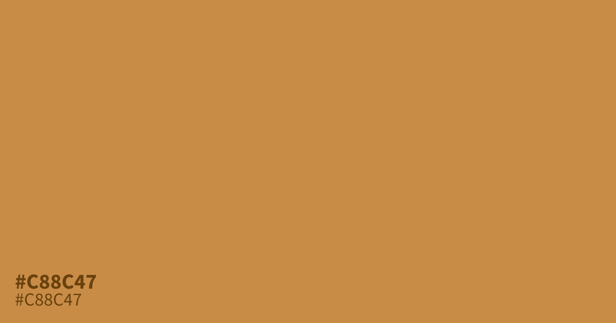
Muted and earthy, #c88c47 is a warm ochre that lacks the intensity of brighter oranges. It feels grounding and approachable, making it an excellent choice for rustic branding or autumn-inspired palettes. Because of its accessible contrast, black text remains highly legible against this hue. Use #c88c47 as a supporting tone alongside deep charcoal or forest green to keep your designs balanced and professional.
Questions about #c88c47
What is #c88c47 in RGB, HSL and CMYK?
In RGB, #c88c47 is rgb(200, 140, 71), in HSL hsl(32, 54%, 53%) and in CMYK 0%, 30%, 65%, 22%. Browse more shades of orange with names and hex codes.
What colors pair best with #c88c47?
This warm ochre pairs perfectly with deep charcoal or soft forest green for a balanced, professional look. Avoid pairing it with overly neon or bright shades, which can overwhelm its earthy, grounded nature and cause visual tension.
Is #c88c47 a warm or cool tone?
It is distinctly warm, carrying golden-orange undertones that create a cozy, inviting atmosphere. This makes it an effective choice for projects needing a tactile, organic feel, especially when applied to natural textures like paper or matte finishes in print design.
Is #c88c47 readable on white or black?
#c88c47 has a 2.87:1 contrast ratio on white and 7.29:1 on black. WCAG asks for 4.5:1 for body text and 3:1 for large text, so on white it is too faint for text and on black it works for body text. Try other pairs in the contrast checker.