
#C7A2B1 Hex Color
Online color picker to view shades, tints, color codes, and complementary colors
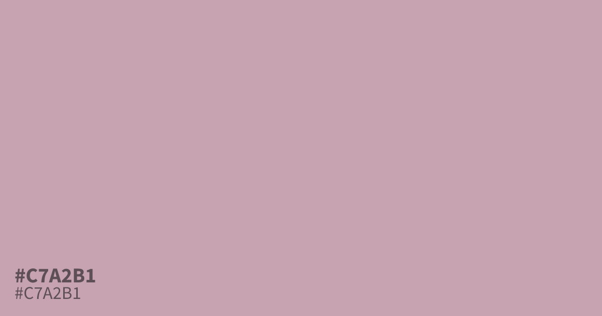
This dusty, unsaturated pink sits between mauve and pastel. Because #c7a2b1 is so muted, it functions best as a supporting tone rather than a dominant background. It pairs exceptionally well with charcoal or deep slate, which prevents it from washing out. With its high contrast against black text, it offers excellent readability for UI components or soft, modern branding.
Questions about #c7a2b1
What is #c7a2b1 in RGB, HSL and CMYK?
In RGB, #c7a2b1 is rgb(199, 162, 177), in HSL hsl(336, 25%, 71%) and in CMYK 0%, 19%, 11%, 22%. Browse more shades of pink with names and hex codes.
What colors pair best with #c7a2b1?
Because #c7a2b1 is quite muted, it benefits from pairing with strong, neutral anchors that provide clear definition. It looks professional and grounded when placed alongside deep charcoal or slate grays, which prevent the color from appearing too washed out.
Is #c7a2b1 suitable for UI design text?
Using #c7a2b1 for body text is generally discouraged due to low contrast against standard white or light backgrounds. It functions far better as a subtle container, soft button background, or a decorative element that sits behind bold, dark typography.
Is #c7a2b1 readable on white or black?
#c7a2b1 has a 2.27:1 contrast ratio on white and 9.23:1 on black. WCAG asks for 4.5:1 for body text and 3:1 for large text, so on white it is too faint for text and on black it works for body text. Try other pairs in the contrast checker.