
#C42D4F Hex Color
Online color picker to view shades, tints, color codes, and complementary colors
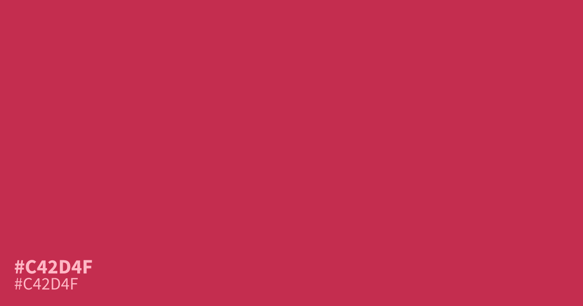
This intense, saturated crimson commands immediate attention, making it an ideal choice for high-impact buttons and bold interface accents. Because it is so loud, use #c42d4f sparingly as a small accent rather than a background color. It pairs surprisingly well with deep, cool charcoals or slate blues to tone down its urgency. White text maintains excellent readability against this strong hue.
Questions about #c42d4f
What is #c42d4f in RGB, HSL and CMYK?
In RGB, #c42d4f is rgb(196, 45, 79), in HSL hsl(346, 63%, 47%) and in CMYK 0%, 77%, 60%, 23%. Browse more shades of red with names and hex codes.
How should I use #c42d4f in UI design?
Reserve #c42d4f for small, high-impact UI elements like primary call-to-action buttons or notification badges. Because this crimson is visually loud, using it as a background color can overwhelm the design and strain the user's eyes over long sessions.
What colors pair best with #c42d4f?
To balance the intensity of #c42d4f, pair it with neutral, cool-toned companions like a deep charcoal or a muted slate blue. These darker, desaturated tones effectively anchor the vibrancy of the crimson and keep your color scheme readable.
Is #c42d4f readable on white or black?
#c42d4f has a 5.47:1 contrast ratio on white and 3.83:1 on black. WCAG asks for 4.5:1 for body text and 3:1 for large text, so on white it works for body text and on black it works only for large text (24px, or 18.5px bold). Try other pairs in the contrast checker.