
#C2BDE4 Hex Color
Online color picker to view shades, tints, color codes, and complementary colors
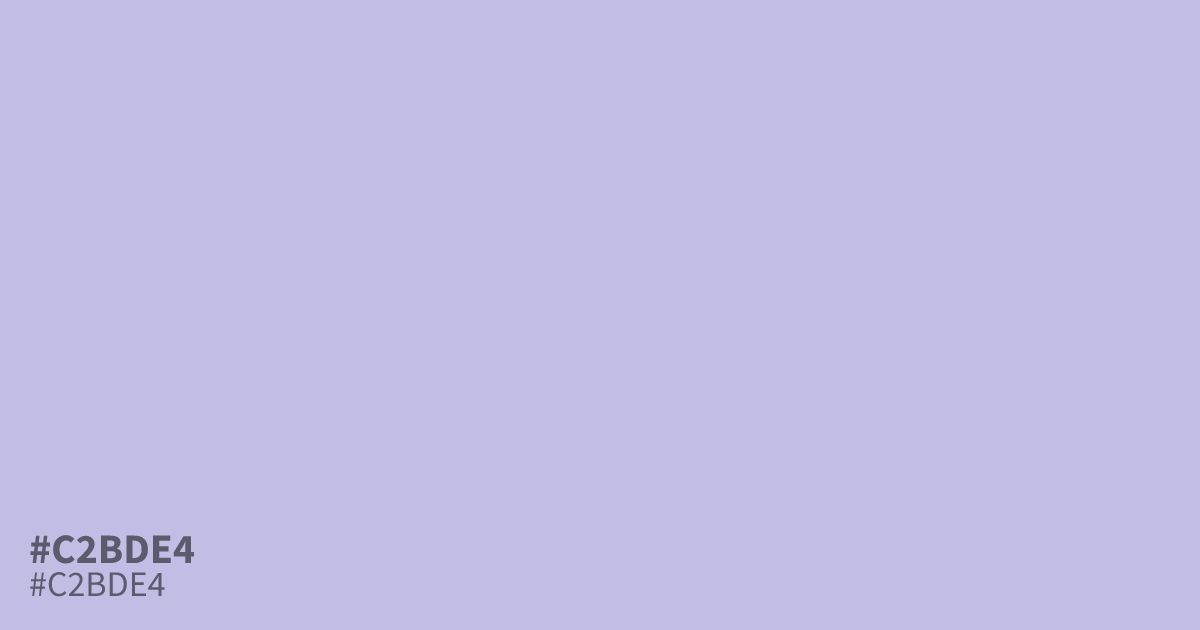
This pastel violet is highly unsaturated, creating a dusty, cool tone that feels gentle and restrained. Because of its light value, #c2bde4 works best as a soft background or a supporting accent rather than a dominant color. Pair it with deep charcoal text to maintain high readability. This hex code is an excellent choice for modern wellness branding or soft, airy UI design.
Questions about #c2bde4
What is #c2bde4 in RGB, HSL and CMYK?
In RGB, #c2bde4 is rgb(194, 189, 228), in HSL hsl(248, 42%, 82%) and in CMYK 15%, 17%, 0%, 11%. Browse more shades of purple with names and hex codes.
What colors pair well with #c2bde4 for web design?
#c2bde4 creates a sophisticated balance when paired with deep charcoal for high-contrast, readable typography. For a soft, cohesive interface, it also works effectively alongside muted teals or creamy off-white tones that prevent the design from feeling overly cold or clinical.
Does #c2bde4 work well as a primary brand color?
While #c2bde4 is excellent for backgrounds or supporting accents, it lacks the saturation needed for a primary brand color meant to stand out. It functions best when used to establish a calm, refined mood in wellness or creative branding projects.
Is #c2bde4 readable on white or black?
#c2bde4 has a 1.79:1 contrast ratio on white and 11.69:1 on black. WCAG asks for 4.5:1 for body text and 3:1 for large text, so on white it is too faint for text and on black it works for body text. Try other pairs in the contrast checker.