
#C25A6D Hex Color
Online color picker to view shades, tints, color codes, and complementary colors
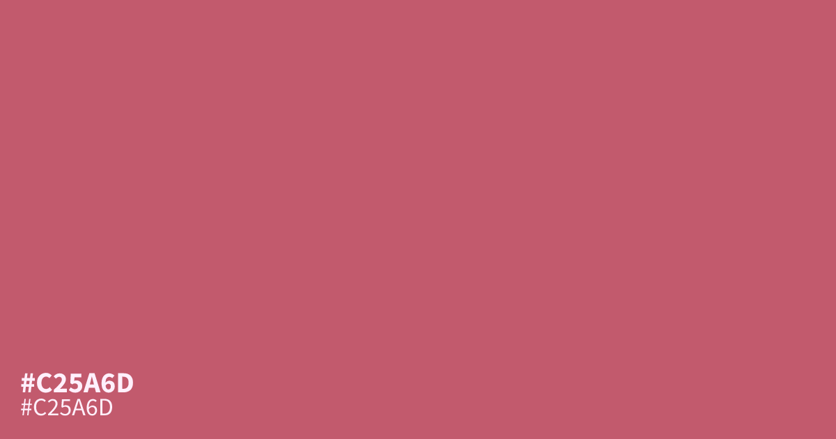
#c25a6d is a muted, dusty brick red with a calm, grounded presence. It sits in that useful middle ground between a shouty red and a flat neutral. Warm without being loud, it carries a soft terracotta character that reads as approachable and settled rather than urgent.
In practice, it shines as a base or supporting color in palettes that need warmth with restraint. It pairs naturally with cream, warm grays, and deep charcoal, and it holds its own next to both light and dark backgrounds. Designers often reach for it when a project calls for an earthy, editorial red, such as branding for food, wellness, or craft-focused brands, where a pure red would feel too aggressive.
One thing to watch: at small sizes, its mid-tone luminance makes fine detail harder to read against white. For text or thin icons placed on top, test contrast carefully. Dark text generally performs better than light text on this color, and white text only clears accessibility thresholds for large type.
In practice, it shines as a base or supporting color in palettes that need warmth with restraint. It pairs naturally with cream, warm grays, and deep charcoal, and it holds its own next to both light and dark backgrounds. Designers often reach for it when a project calls for an earthy, editorial red, such as branding for food, wellness, or craft-focused brands, where a pure red would feel too aggressive.
One thing to watch: at small sizes, its mid-tone luminance makes fine detail harder to read against white. For text or thin icons placed on top, test contrast carefully. Dark text generally performs better than light text on this color, and white text only clears accessibility thresholds for large type.
Questions about #c25a6d
What is #c25a6d in RGB, HSL and CMYK?
In RGB, #c25a6d is rgb(194, 90, 109), in HSL hsl(349, 46%, 56%) and in CMYK 0%, 54%, 44%, 24%. Browse more shades of pink with names and hex codes.
What colors pair well with #c25a6d?
Cream, warm beige, soft charcoal, and muted sage all complement it well. It also works with deeper terracottas and warm grays for a tonal, earthy palette.
Is #c25a6d readable on white or black?
#c25a6d has a 4.21:1 contrast ratio on white and 4.97:1 on black. WCAG asks for 4.5:1 for body text and 3:1 for large text, so on white it works only for large text (24px, or 18.5px bold) and on black it works for body text. Try other pairs in the contrast checker.