
#C1AB94 Hex Color
Online color picker to view shades, tints, color codes, and complementary colors
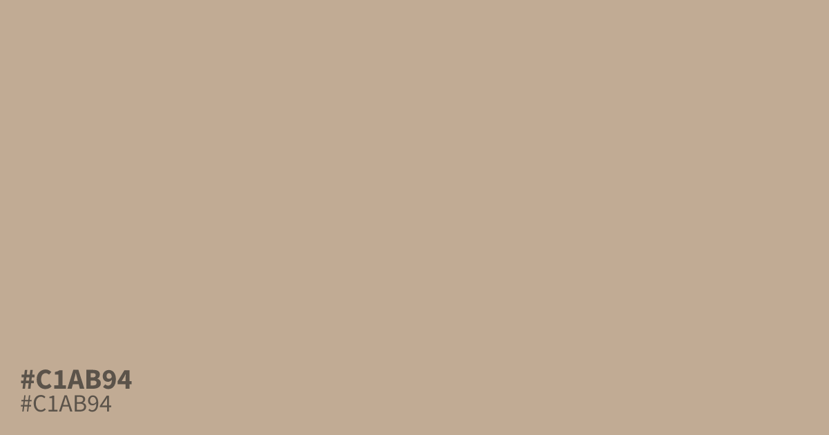
Think weathered kraft paper with a whisper of orange. #c1ab94 is a dusty pastel shade with very low saturation, so it reads soft and calm rather than bold. That muted quality suits spring packaging, baby products, and relaxed autumn palettes. It works best as a dominant background or supporting tone, since black text stays readable on it at about 9.5:1 contrast. Against pure white it can look washed out, so pair it with deeper earthy colors to keep it grounded.
Questions about #c1ab94
What is #c1ab94 in RGB, HSL and CMYK?
In RGB, #c1ab94 is rgb(193, 171, 148), in HSL hsl(31, 27%, 67%) and in CMYK 0%, 11%, 23%, 24%. Browse more shades of brown with names and hex codes.
What colors pair well with #c1ab94?
Deep teal and navy give it contrast, while terracotta and cream keep things warm and earthy. Its low saturation lets richer accent colors stand out without clashing.
Is #c1ab94 readable on white or black?
#c1ab94 has a 2.20:1 contrast ratio on white and 9.52:1 on black. WCAG asks for 4.5:1 for body text and 3:1 for large text, so on white it is too faint for text and on black it works for body text. Try other pairs in the contrast checker.