
#BA1416 Hex Color
Online color picker to view shades, tints, color codes, and complementary colors
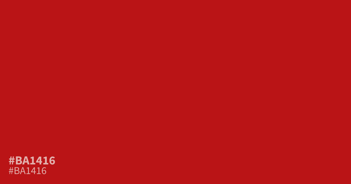
A saturated, high-intensity red, #ba1416 demands attention immediately. This warm tone works best as a sharp accent or CTA button rather than a background, as its sheer volume can easily overwhelm a layout. It pairs surprisingly well with deep charcoal grays to ground its aggression. Because white text offers excellent readability here with a 6.6:1 contrast ratio, use it for bold UI elements or urgent alerts.
Questions about #ba1416
What is #ba1416 in RGB, HSL and CMYK?
In RGB, #ba1416 is rgb(186, 20, 22), in HSL hsl(359, 81%, 40%) and in CMYK 0%, 89%, 88%, 27%. Browse more shades of red with names and hex codes.
How should I use #ba1416 in a user interface?
#ba1416 works best as an alert or call-to-action button where you need to guide the user's eye immediately. Because it is highly saturated, avoid using it for large backgrounds or body text, as it can strain the eyes and overwhelm your layout.
What colors pair well with #ba1416?
Pair #ba1416 with charcoal or deep, dark neutrals to ground the color and reduce its aggressive vibration. Using white text over this red creates a strong contrast ratio of 6.6:1, ensuring high readability for vital UI components or navigation elements.
Is #ba1416 readable on white or black?
#ba1416 has a 6.56:1 contrast ratio on white and 3.19:1 on black. WCAG asks for 4.5:1 for body text and 3:1 for large text, so on white it works for body text and on black it works only for large text (24px, or 18.5px bold). Try other pairs in the contrast checker.