
#B85263 Hex Color
Online color picker to view shades, tints, color codes, and complementary colors
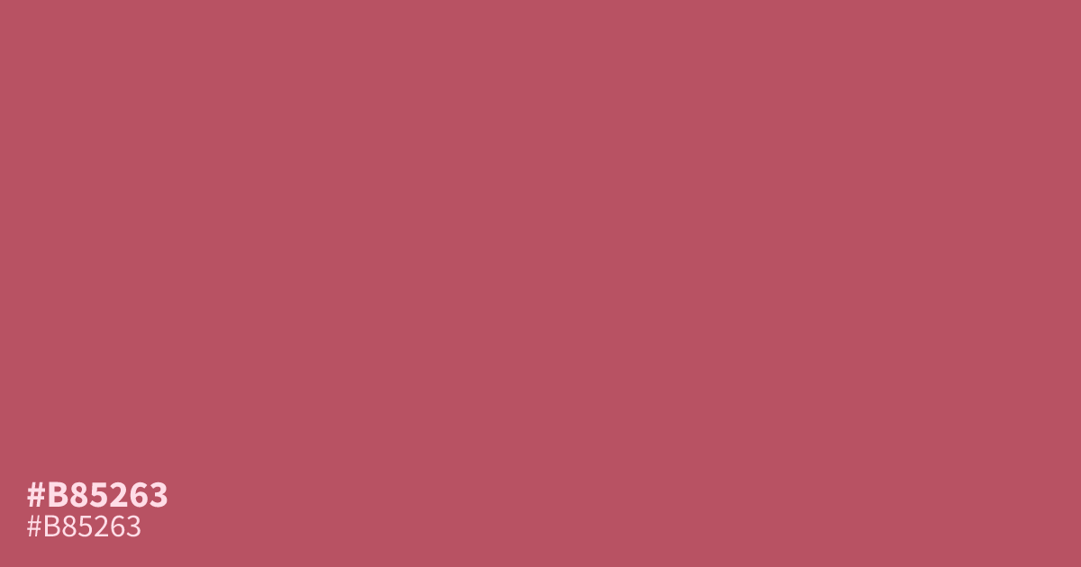
A muted, warm red with terracotta and dusty rose undertones, #b85263 feels grounded without losing energy. Its mellow saturation suits rustic branding, autumn palettes, food packaging, and romance-focused designs. Use it as a supporting tone beside deep navy or creamy beige rather than a full-page background. White text reaches about 4.7:1 contrast, meeting WCAG AA for body text. The hex code is #b85263.
Questions about #b85263
What is #b85263 in RGB, HSL and CMYK?
In RGB, #b85263 is rgb(184, 82, 99), in HSL hsl(350, 42%, 52%) and in CMYK 0%, 55%, 46%, 28%. Browse more shades of pink with names and hex codes.
What colors pair well with #b85263?
Does #b85263 read as warm or cool?
#b85263 reads as a warm, muted red because its red base is softened by dusty rose and terracotta undertones, giving it an earthy, approachable mood rather than a sharp crimson effect. It works especially well in autumnal and romantic visual themes.
Where does #b85263 work best in a design?
Use #b85263 as a supporting color for rustic branding, autumn palettes, food packaging, and romantic designs; its muted warmth adds character to accents, buttons, labels, and illustrations without overwhelming a full layout. Pair it with cream or navy for balanced compositions.
Is #b85263 readable on white or black?
#b85263 has a 4.74:1 contrast ratio on white and 4.42:1 on black. WCAG asks for 4.5:1 for body text and 3:1 for large text, so on white it works for body text and on black it works only for large text (24px, or 18.5px bold). Try other pairs in the contrast checker.