
#B75E7C Hex Color
Online color picker to view shades, tints, color codes, and complementary colors
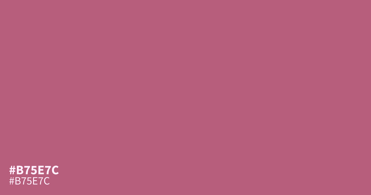
This dusty, unsaturated pink sits between mauve and terracotta, offering a subdued and warm presence. Because #b75e7c is relatively muted, it functions best as a supporting tone rather than a dominant background. Pair it with dark slate or charcoal grays to ground its femininity. Its high contrast ratio ensures that black text remains legible, making it suitable for clean UI accents or editorial fashion layouts.
Questions about #b75e7c
What is #b75e7c in RGB, HSL and CMYK?
In RGB, #b75e7c is rgb(183, 94, 124), in HSL hsl(340, 38%, 54%) and in CMYK 0%, 49%, 32%, 28%. Browse more shades of pink with names and hex codes.
What color palettes work well with #b75e7c?
Because #b75e7c has a warm, earthy quality, it pairs beautifully with dark, neutral tones like charcoal or deep slate to create a sophisticated balance. Avoid pairing it with high-saturation neons, which can overwhelm its delicate, muted nature and make the palette feel disjointed.
Does #b75e7c read as a warm or cool tone?
This hex code is firmly a warm color, sitting comfortably between a dusty mauve and a muted terracotta. Its subtle red and brown undertones provide a gentle, inviting presence that avoids the harshness often found in brighter, primary pinks or cooler magenta shades.
Is #b75e7c readable on white or black?
#b75e7c has a 4.28:1 contrast ratio on white and 4.90:1 on black. WCAG asks for 4.5:1 for body text and 3:1 for large text, so on white it works only for large text (24px, or 18.5px bold) and on black it works for body text. Try other pairs in the contrast checker.