
#B6372B Hex Color
Online color picker to view shades, tints, color codes, and complementary colors
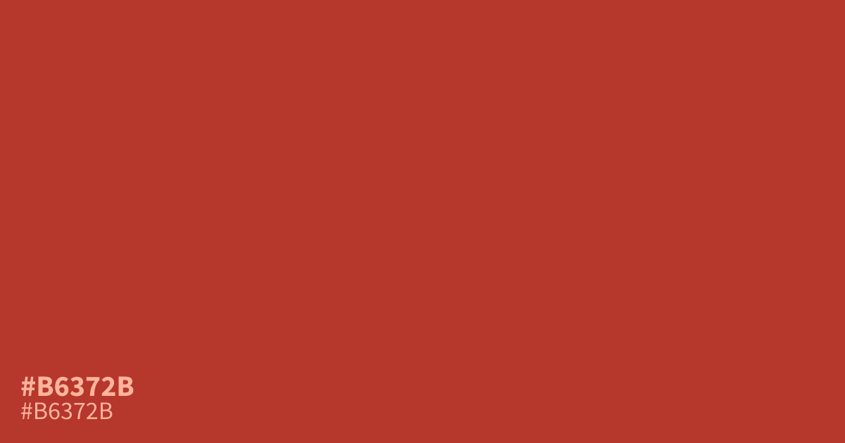
#b6372b is a saturated, warm terracotta with enough intensity to command attention. Because it leans toward a rustic, earthy red, it functions best as a high-impact accent color rather than a primary background. Pair it with muted slate grays or creams to balance its aggression. With a 5.9:1 contrast ratio against white, it remains legible for small UI elements and call-to-action buttons.
Questions about #b6372b
What is #b6372b in RGB, HSL and CMYK?
In RGB, #b6372b is rgb(182, 55, 43), in HSL hsl(5, 62%, 44%) and in CMYK 0%, 70%, 76%, 29%. Browse more shades of red with names and hex codes.
Why does #b6372b feel more aggressive than standard reds?
The intensity comes from its heavy warm undertones and high saturation, which pushes it closer to a brick red than a primary hue. Use it sparingly as a highlight color rather than a large background to avoid overwhelming your viewer.
What colors effectively balance the intensity of #b6372b?
Is #b6372b readable on white or black?
#b6372b has a 5.88:1 contrast ratio on white and 3.57:1 on black. WCAG asks for 4.5:1 for body text and 3:1 for large text, so on white it works for body text and on black it works only for large text (24px, or 18.5px bold). Try other pairs in the contrast checker.