
#B46BB6 Hex Color
Muted violet for graceful creativity
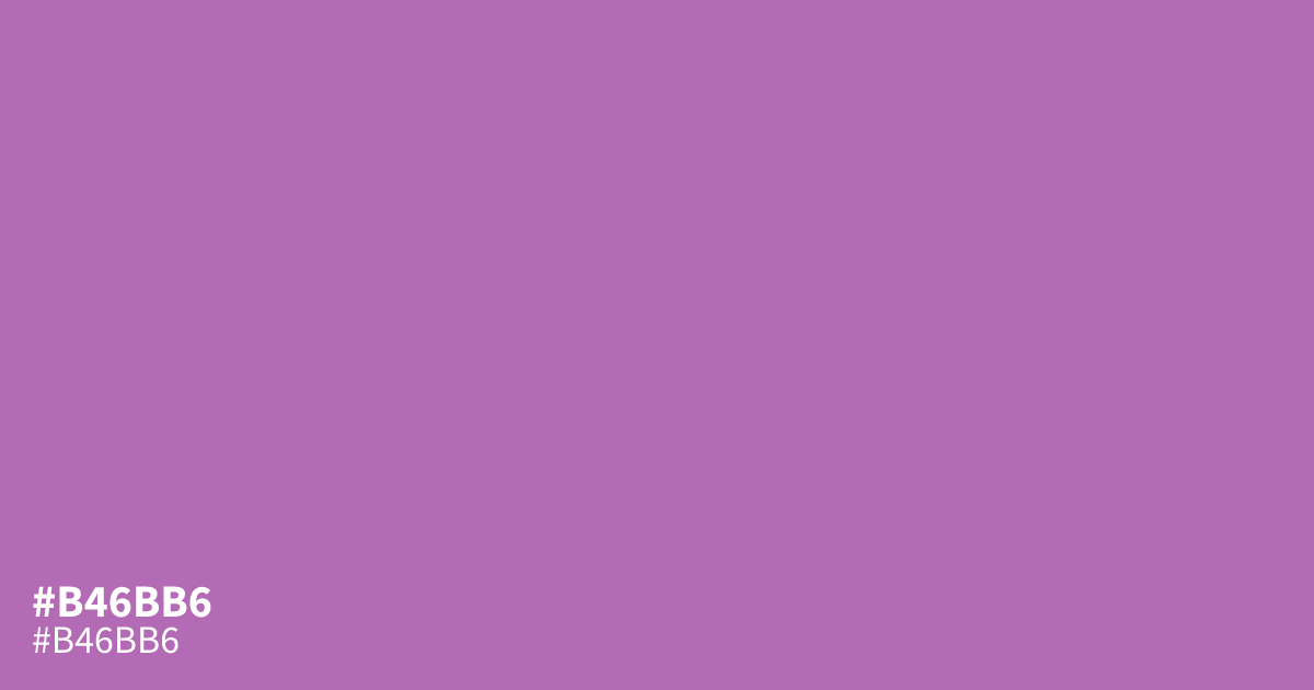
With its muted saturation and medium-light value, #b46bb6 is a cool purple with soft violet and pink undertones. It brings a spiritual, graceful mood to cosmetics, wellness, weddings, and creative branding. Use it as a supporting tone beside navy or warm cream rather than a full background. Black text reads clearly on this color. The hex code is #b46bb6.
Questions about #b46bb6
What is #b46bb6 in RGB, HSL and CMYK?
In RGB, #b46bb6 is rgb(180, 107, 182), in HSL hsl(298, 34%, 57%) and in CMYK 1%, 41%, 0%, 29%. Browse more shades of pink with names and hex codes.
What colors pair well with #b46bb6?
Navy and warm cream pair well with #b46bb6, balancing its cool violet-pink undertones with depth and softness while keeping the palette graceful across polished branding, editorial layouts, and wedding invitations. Use the purple as an accent or secondary tone, then test text contrast before adding labels.
Does #b46bb6 read as warm or cool?
The hex color #b46bb6 reads as cool purple because its violet base is balanced by soft pink undertones, giving it a calm, graceful character rather than a strongly blue or red appearance. It can still feel gentle and romantic in lighter palettes.
Is black or white text better on #b46bb6?
Black text is the stronger choice for #b46bb6, with a contrast ratio of about 5.7:1 compared with roughly 3.7:1 for white, making black suitable for normal-sized text under WCAG AA. Use a contrast checker for specific font sizes and weights.
Is #b46bb6 readable on white or black?
#b46bb6 has a 3.67:1 contrast ratio on white and 5.71:1 on black. WCAG asks for 4.5:1 for body text and 3:1 for large text, so on white it works only for large text (24px, or 18.5px bold) and on black it works for body text. Try other pairs in the contrast checker.