
#B21031 Hex Color
Online color picker to view shades, tints, color codes, and complementary colors
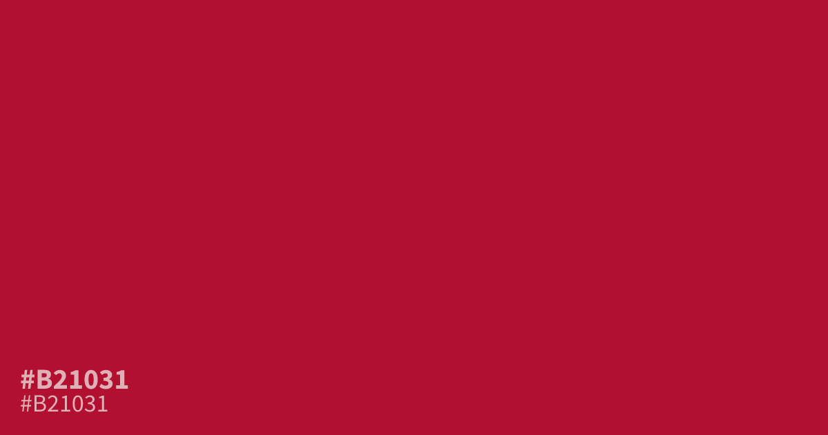
#b21031 is a saturated, authoritative red with high intensity. Because it carries so much visual weight, it works best as a 10% accent color for calls to action rather than a background. Pair it with soft cream or slate gray to avoid overwhelming the eye. While it provides enough contrast for readable text, use it sparingly in UI design to maintain focus.
Questions about #b21031
What is #b21031 in RGB, HSL and CMYK?
In RGB, #b21031 is rgb(178, 16, 49), in HSL hsl(348, 84%, 38%) and in CMYK 0%, 91%, 72%, 30%. Browse more shades of red with names and hex codes.
How should I use #b21031 in UI design without overwhelming the interface?
Because #b21031 carries immense visual weight, treat it as a ten percent accent color rather than a background filler. It works effectively for high-priority calls to action, drawing the eye directly to functional elements while leaving the rest of the layout breathable.
What colors pair well with the intensity of #b21031?
Pair #b21031 with cream or slate gray to anchor its intensity and create a balanced, professional contrast. Avoiding pure black helps prevent the red from vibrating visually, keeping the color scheme readable and easy on the eyes for extended viewing.
Is #b21031 readable on white or black?
#b21031 has a 6.97:1 contrast ratio on white and 3.01:1 on black. WCAG asks for 4.5:1 for body text and 3:1 for large text, so on white it works for body text and on black it works only for large text (24px, or 18.5px bold). Try other pairs in the contrast checker.