
#AEB7D7 Hex Color
Online color picker to view shades, tints, color codes, and complementary colors
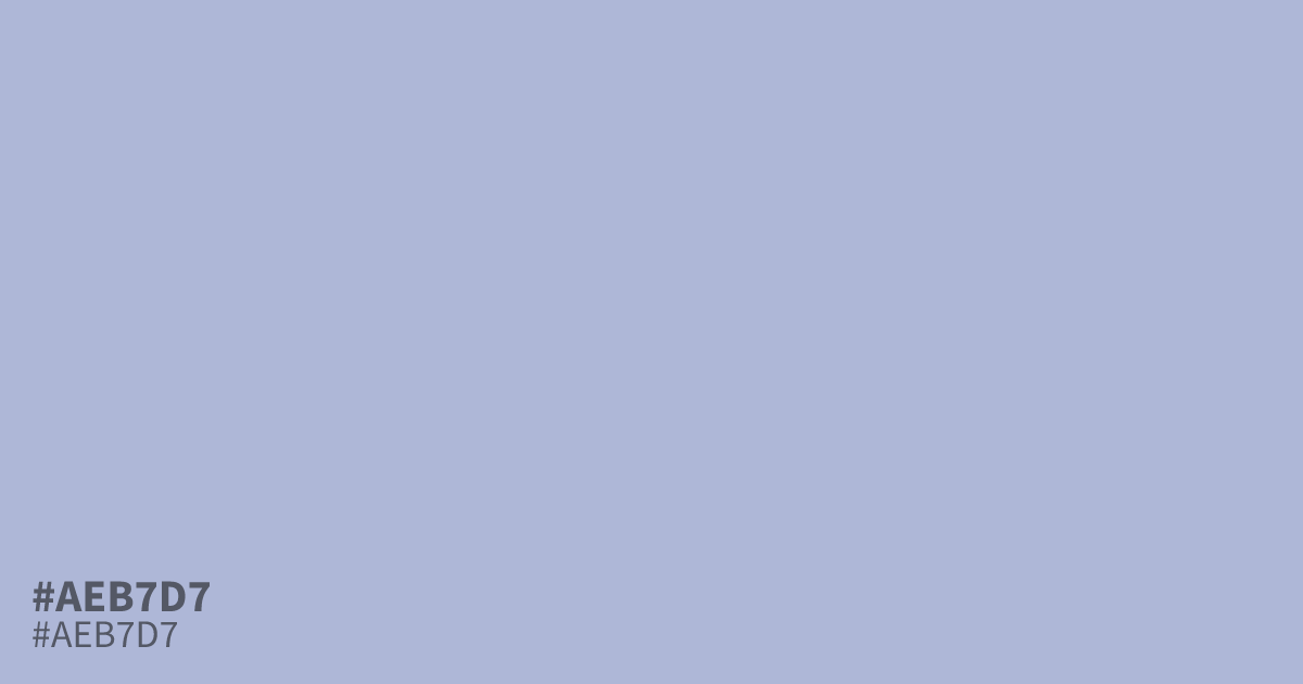
This dusty, desaturated periwinkle brings a soft, ethereal quality to design layouts. Because it sits comfortably between gray and blue, #aeb7d7 works well as a grounding neutral that feels less sterile than white. It pairs beautifully with charcoal or slate, creating enough contrast to support small, readable body text. Use this hex code as a soothing background shade for wellness or lifestyle brands.
Questions about #aeb7d7
What is #aeb7d7 in RGB, HSL and CMYK?
In RGB, #aeb7d7 is rgb(174, 183, 215), in HSL hsl(227, 34%, 76%) and in CMYK 19%, 15%, 0%, 16%. Browse more shades of blue with names and hex codes.
How should I use #aeb7d7 in interface design?
Use #aeb7d7 as a soothing background color for wellness or lifestyle websites where you need to avoid the sterility of white. Because it is desaturated, it provides a gentle, professional backdrop that allows darker text like charcoal to remain highly readable.
Does #aeb7d7 lean more warm or cool?
#aeb7d7 leans distinctly cool due to its strong blue and violet base, though the gray undertones keep it from feeling icy. It sits comfortably between blue and gray, making it a versatile neutral that feels sophisticated rather than bright or juvenile.
Is #aeb7d7 readable on white or black?
#aeb7d7 has a 1.98:1 contrast ratio on white and 10.55:1 on black. WCAG asks for 4.5:1 for body text and 3:1 for large text, so on white it is too faint for text and on black it works for body text. Try other pairs in the contrast checker.