
#AE97CD Hex Color
Online color picker to view shades, tints, color codes, and complementary colors
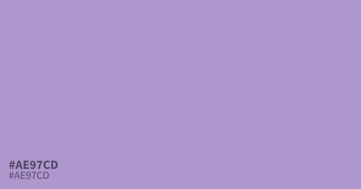
This muted, unsaturated violet feels gentle and calm, leaning into a cool, powdery aesthetic. Because it is light and airy, #ae97cd works best as a primary background or a soft accent for wellness branding. Pair it with charcoal gray text for readability, as the contrast ratio easily meets accessibility standards. Its desaturated quality prevents it from becoming overwhelming in large, full-screen designs.
Questions about #ae97cd
What is #ae97cd in RGB, HSL and CMYK?
In RGB, #ae97cd is rgb(174, 151, 205), in HSL hsl(266, 35%, 70%) and in CMYK 15%, 26%, 0%, 20%. Browse more shades of purple with names and hex codes.
What colors pair well with #ae97cd?
Pair #ae97cd with a deep charcoal for high-contrast, readable text, or use soft creams and cool teals to enhance its airy, wellness-focused aesthetic. Its desaturated nature makes it surprisingly versatile for sophisticated, low-contrast monochromatic palettes.
Is #ae97cd considered a warm or cool color?
#ae97cd is decidedly a cool-toned color, leaning into icy and powdery violet hues that evoke stillness rather than heat. This inherent coolness makes it an excellent choice for backgrounds where you want to minimize visual noise and create a soothing user experience.
Is #ae97cd readable on white or black?
#ae97cd has a 2.59:1 contrast ratio on white and 8.10:1 on black. WCAG asks for 4.5:1 for body text and 3:1 for large text, so on white it is too faint for text and on black it works for body text. Try other pairs in the contrast checker.