
#AC642C Hex Color
Online color picker to view shades, tints, color codes, and complementary colors
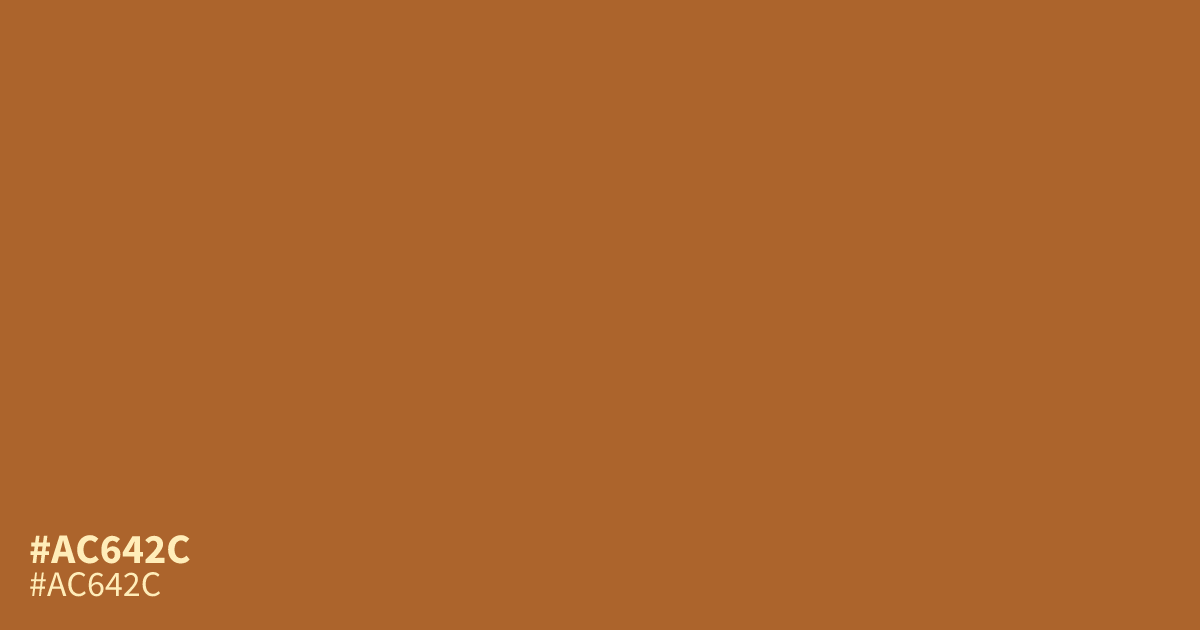
This muted orange sits between warm terracotta and earthy rust. Because of its mellow saturation, #ac642c works effectively as a secondary accent rather than a dominant background. It pairs well with deep forest greens for a natural, grounded look. Since black text provides excellent contrast at 4.6:1, you can safely use this shade for readable small type or UI elements without compromising accessibility.
Questions about #ac642c
What is #ac642c in RGB, HSL and CMYK?
In RGB, #ac642c is rgb(172, 100, 44), in HSL hsl(26, 59%, 42%) and in CMYK 0%, 42%, 74%, 33%. Browse more shades of brown with names and hex codes.
What colors pair best with the #ac642c terracotta shade?
#ac642c looks best when paired with deep forest green or creamy off-white neutrals. These combinations create a grounded, organic feel that lets the muted orange provide warmth without overwhelming the surrounding design elements on your screen.
Is #ac642c suitable for small UI text and labels?
Yes, you can safely use #ac642c for small text because it provides enough contrast against white or light backgrounds. It maintains a 4.6:1 contrast ratio with black text, ensuring that your user interface remains readable and accessible for most users.
Is #ac642c readable on white or black?
#ac642c has a 4.55:1 contrast ratio on white and 4.61:1 on black. WCAG asks for 4.5:1 for body text and 3:1 for large text, so on white it works for body text and on black it works for body text. Try other pairs in the contrast checker.