
#AB45B3 Hex Color
Online color picker to view shades, tints, color codes, and complementary colors
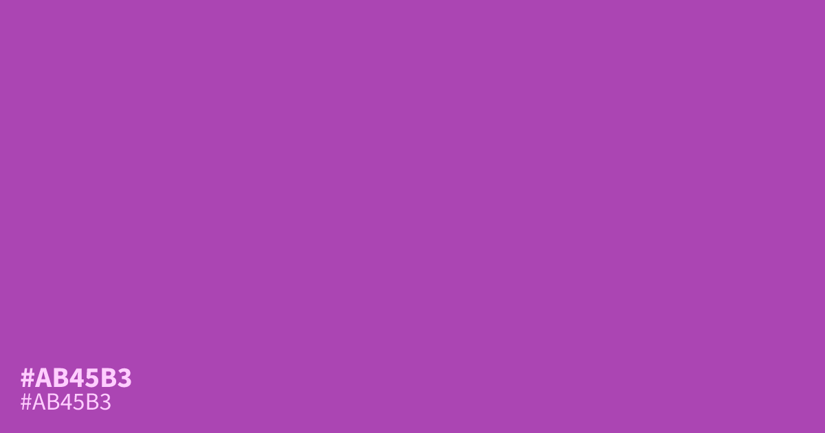
This saturated violet carries a high intensity that commands immediate attention. Because of its brightness, #ab45b3 works best as a sharp accent color rather than a large-scale background. It pairs surprisingly well with muted teals, balancing its flamboyant nature with cooler tones. When using this hex code for interface text, ensure a high contrast ratio to maintain legibility.
Questions about #ab45b3
What is #ab45b3 in RGB, HSL and CMYK?
In RGB, #ab45b3 is rgb(171, 69, 179), in HSL hsl(296, 44%, 49%) and in CMYK 4%, 61%, 0%, 30%. Browse more shades of purple with names and hex codes.
What colors pair best with #ab45b3 for a balanced design?
This vibrant violet creates a sophisticated contrast when balanced with muted, earthy tones like sage or soft slate blue. Using #ab45b3 alongside desaturated colors prevents the intensity from becoming overwhelming while still allowing the violet to function as a focal point.
Is #ab45b3 suitable for interface text and UI elements?
Because of its high saturation and brightness, #ab45b3 is generally too intense for large blocks of body text and can cause eye strain. It works much better as a primary action button or a graphical highlight where contrast ratios against white or charcoal backgrounds are carefully managed.
Is #ab45b3 readable on white or black?
#ab45b3 has a 4.96:1 contrast ratio on white and 4.23:1 on black. WCAG asks for 4.5:1 for body text and 3:1 for large text, so on white it works for body text and on black it works only for large text (24px, or 18.5px bold). Try other pairs in the contrast checker.