
#A65B3F Hex Color
Online color picker to view shades, tints, color codes, and complementary colors
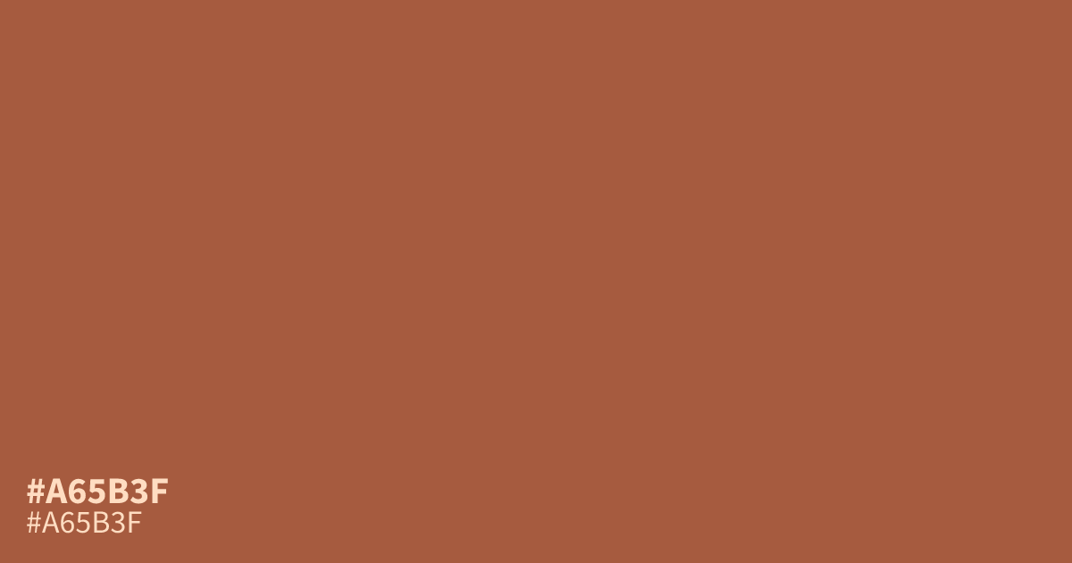
Muted terracotta with real warmth, #a65b3f sits between burnt orange and brick. Its low saturation keeps it grounded, so it reads earthy rather than loud. Use it as a dominant base in autumn themes, food branding, or sports graphics, or pair it with cream and sage for balance. White text passes contrast checks on top of it, which makes it practical for buttons and calls to action.
Questions about #a65b3f
What is #a65b3f in RGB, HSL and CMYK?
In RGB, #a65b3f is rgb(166, 91, 63), in HSL hsl(16, 45%, 45%) and in CMYK 0%, 45%, 62%, 35%. Browse more shades of brown with names and hex codes.
What colors pair well with #a65b3f?
#a65b3f flatters cream, sage, and navy. It also looks richer next to burgundy than beside bright orange, since the muted saturation keeps the whole palette from competing.
Is #a65b3f a good background color for text?
Yes for larger text. White text on #a65b3f reaches about 5.0:1 contrast, which clears WCAG AA for body copy. For small fine print, a darker shade or lighter text works better.
What mood does #a65b3f convey?
It reads warm, approachable, and a little adventurous. The muted saturation gives it a mellow, handcrafted feel rather than the high energy of pure orange.
Is #a65b3f readable on white or black?
#a65b3f has a 5.01:1 contrast ratio on white and 4.18:1 on black. WCAG asks for 4.5:1 for body text and 3:1 for large text, so on white it works for body text and on black it works only for large text (24px, or 18.5px bold). Try other pairs in the contrast checker.