
#A60326 Hex Color
Online color picker to view shades, tints, color codes, and complementary colors
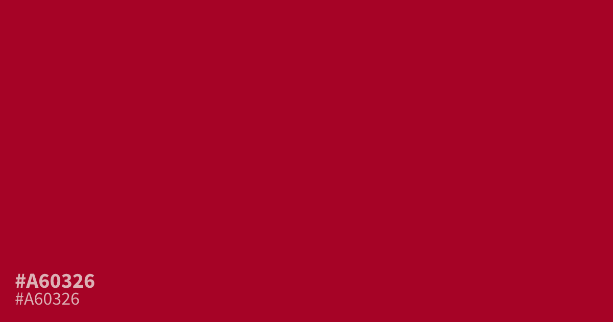
#a60326 is an intense, saturated crimson that demands attention. Because it is highly pigmented and dark, use this hue sparingly as a 10 percent accent rather than a full page background. It pairs exceptionally well with cool slate grays or muted off-whites to ground the aggression. While readable with white text, the hex code #a60326 works best for buttons or call to action highlights.
Questions about #a60326
What is #a60326 in RGB, HSL and CMYK?
In RGB, #a60326 is rgb(166, 3, 38), in HSL hsl(347, 96%, 33%) and in CMYK 0%, 98%, 77%, 35%. Browse more shades of red with names and hex codes.
How should I use #a60326 in my design projects?
This shade is extremely intense and works best as a small-scale accent color. Use it for call-to-action buttons or highlights where you need to draw attention, as using it on large surfaces like backgrounds often creates visual fatigue.
Which colors pair well with #a60326?
To balance its high energy, pair #a60326 with neutral tones like cool slate gray or muted off-white. These neutral backgrounds provide necessary contrast that grounds the color and keeps your overall layout from feeling overwhelming or aggressive to the viewer.
Is #a60326 readable on white or black?
#a60326 has a 7.88:1 contrast ratio on white and 2.66:1 on black. WCAG asks for 4.5:1 for body text and 3:1 for large text, so on white it works for body text and on black it is too faint for text. Try other pairs in the contrast checker.