
#A2A687 Hex Color
Online color picker to view shades, tints, color codes, and complementary colors
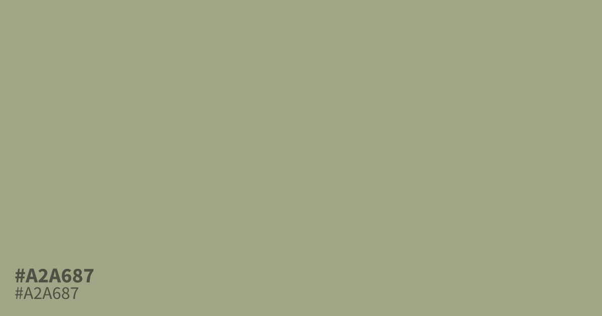
A soft, muted green with gray undertones, #a2a687 sits in that quiet space between sage and sage’s sleepier cousin. It reads as a dusty sage green: calm, slightly warm, and never loud. On screen it works best as a supporting player, behind darker text or paired with cream and wood tones, where its low saturation keeps a palette feeling grounded rather than washed out. In print and interiors it shows up everywhere from nursery walls to heritage branding, anywhere a color needs to sit back and let the content lead. Its closest loud cousin is a true grass green, but turned down this far, #a2a687 behaves more like a neutral with a hint of green than a green with a hint of gray.
Questions about #a2a687
What is #a2a687 in RGB, HSL and CMYK?
In RGB, #a2a687 is rgb(162, 166, 135), in HSL hsl(68, 15%, 59%) and in CMYK 2%, 0%, 19%, 35%. Browse more shades of green with names and hex codes.
What colors pair well with #a2a687?
Cream, warm white, and soft charcoal are the safest partners. For more contrast, try pairing it with a deep terracotta or a muted navy; the green sits back and lets the darker tone lead.
Does #a2a687 work as a background color for text?
Yes, but choose your text color carefully. Dark charcoal or near-black text passes contrast checks against it comfortably; white text on #a2a687 is borderline, so test it before committing.
Is #a2a687 warm or cool?
It leans warm-neutral. The green base pulls it toward nature, but its grayish undertone keeps it from reading as a true green, which is why it pairs so easily with both warm and cool palettes.
Is #a2a687 readable on white or black?
#a2a687 has a 2.51:1 contrast ratio on white and 8.34:1 on black. WCAG asks for 4.5:1 for body text and 3:1 for large text, so on white it is too faint for text and on black it works for body text. Try other pairs in the contrast checker.