
#972632 Hex Color
A serious and grounded dark brick red
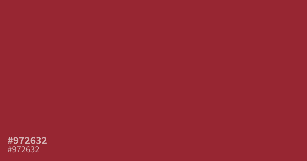
This dark, muted brick red carries a serious, grounded weight. Because #972632 is fairly saturated, it works best as a bold accent color rather than a primary background. Pair it with soft cream or warm gray to balance its intensity. With an 8.0:1 contrast ratio against white, it remains highly legible for UI elements and branding headers that require authority and stability.
Questions about #972632
What is #972632 in RGB, HSL and CMYK?
In RGB, #972632 is rgb(151, 38, 50), in HSL hsl(354, 60%, 37%) and in CMYK 0%, 75%, 67%, 41%. Browse more shades of red with names and hex codes.
Where does #972632 work best in UI design?
#972632 functions effectively as a bold accent for headers or call-to-action buttons where you need to project stability and authority. Because it has high contrast against light backgrounds, it maintains readability without needing to rely on a darker primary hue for text.
Which colors balance the intensity of #972632?
Pair this color with neutral tones like cream or warm gray to keep the palette grounded and prevent the saturation from overwhelming your design. Avoid pairing it with high-vibration neon colors, as these clashes will distract from the serious, professional mood you are trying to establish.
Is #972632 readable on white or black?
#972632 has a 7.95:1 contrast ratio on white and 2.63:1 on black. WCAG asks for 4.5:1 for body text and 3:1 for large text, so on white it works for body text and on black it is too faint for text. Try other pairs in the contrast checker.