
#970E41 Hex Color
Online color picker to view shades, tints, color codes, and complementary colors
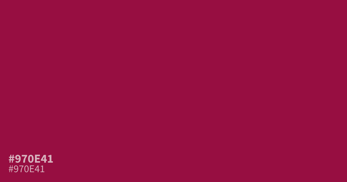
This dark, saturated red holds intense energy and a moody, serious weight. Because of its high pigment, #970e41 works best as a bold accent or a 10% pop in a palette rather than a full background. It pairs exceptionally well with muted gold or cool slate gray. This hex code provides excellent contrast for white text, ensuring readability in formal branding or high-contrast UI designs.
Questions about #970e41
What is #970e41 in RGB, HSL and CMYK?
In RGB, #970e41 is rgb(151, 14, 65), in HSL hsl(338, 83%, 32%) and in CMYK 0%, 91%, 57%, 41%. Browse more shades of pink with names and hex codes.
Where should I use the #970e41 color in my design?
This deep saturated red functions best as a focused accent or a small visual pop rather than a background. Use #970e41 to draw the eye to call-to-action buttons or headers, ensuring it remains balanced by generous amounts of neutral white space.
Which colors pair well with #970e41 for a balanced palette?
You can create a sophisticated look by pairing this intense shade with muted gold or cool slate gray. These complementary tones help ground the heavy, energetic nature of #970e41 while maintaining a clean, high-contrast aesthetic that keeps your design readable.
Is #970e41 readable on white or black?
#970e41 has a 8.55:1 contrast ratio on white and 2.45:1 on black. WCAG asks for 4.5:1 for body text and 3:1 for large text, so on white it works for body text and on black it is too faint for text. Try other pairs in the contrast checker.