
#9692BD Hex Color
A calm and refined dusty violet
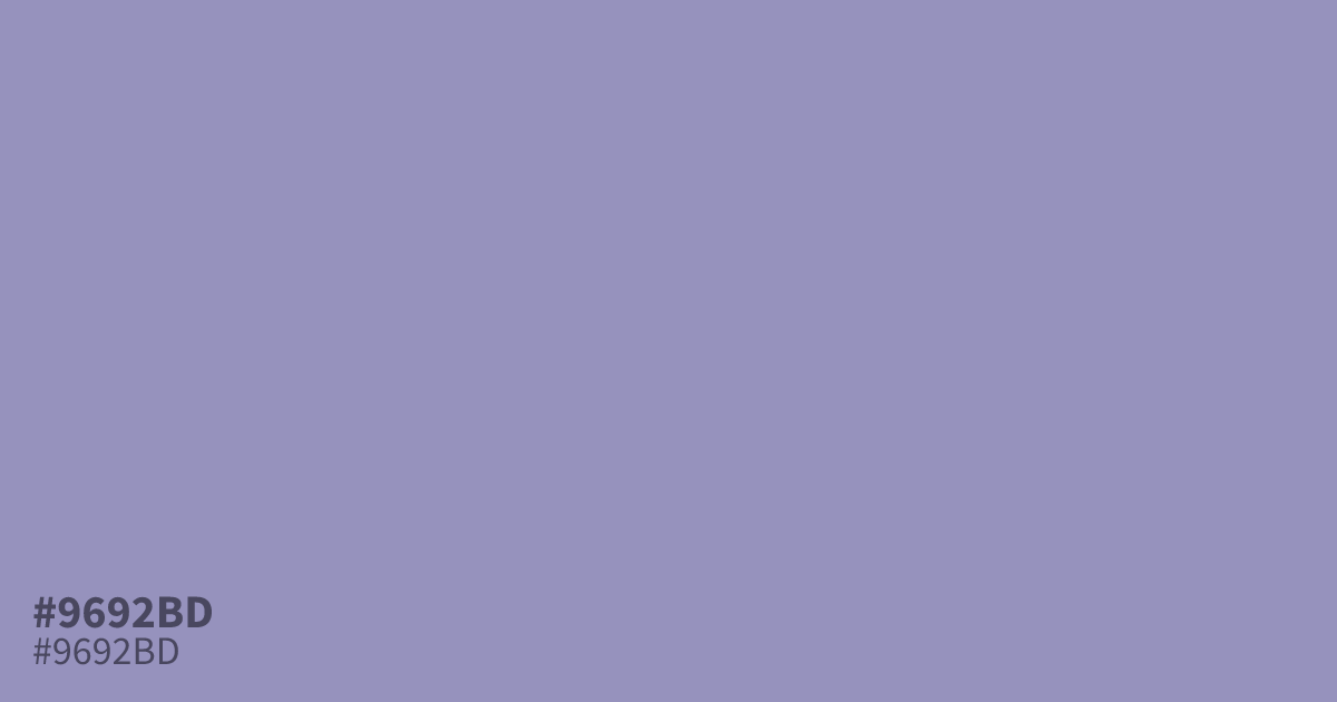
This dusty, unsaturated violet feels refined and calm without being overwhelming. Because of its muted, ashy quality, #9692bd works exceptionally well as a grounding background color for wellness branding or elegant web interfaces. It maintains excellent readability with high-contrast dark text. Avoid pairing it with overly saturated neons, as this hex code shines brightest alongside soft neutrals or deep charcoal grays.
Questions about #9692bd
What is #9692bd in RGB, HSL and CMYK?
In RGB, #9692bd is rgb(150, 146, 189), in HSL hsl(246, 25%, 66%) and in CMYK 21%, 23%, 0%, 26%. Browse more shades of purple with names and hex codes.
What color schemes work best with #9692bd?
This dusty violet thrives when paired with soft, off-white neutrals or deep charcoal grays. Avoid combining it with bright, saturated neons, which can overwhelm its subtle, ashy quality and make the overall color palette feel disjointed or visually jarring.
Does #9692bd read as a warm or cool color?
The #9692bd shade leans cool due to its strong violet undertones. This makes it an excellent choice for creating a serene, professional, and quiet visual environment, especially in digital layouts where readability against dark typography is a primary design concern.
Is #9692bd readable on white or black?
#9692bd has a 2.93:1 contrast ratio on white and 7.14:1 on black. WCAG asks for 4.5:1 for body text and 3:1 for large text, so on white it is too faint for text and on black it works for body text. Try other pairs in the contrast checker.