
#92A6E3 Hex Color
Online color picker to view shades, tints, color codes, and complementary colors
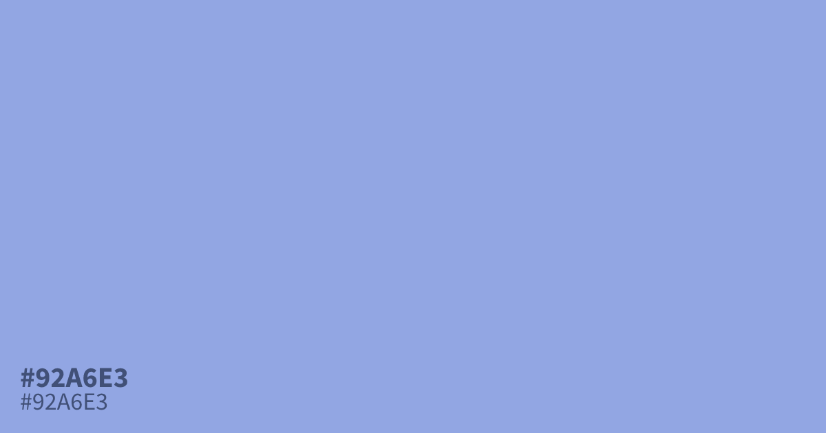
Think of a softened periwinkle and you have #92a6e3, a pastel blue with a muted, powdery finish. Its low saturation keeps things gentle, which suits spring themes, baby products, and calm app backgrounds. Black text sits well on top at about 8.8:1 contrast, so small copy stays readable. For accents, warm terracotta flatters this hex code better than plain neutrals.
Questions about #92a6e3
What is #92a6e3 in RGB, HSL and CMYK?
In RGB, #92a6e3 is rgb(146, 166, 227), in HSL hsl(225, 59%, 73%) and in CMYK 36%, 27%, 0%, 11%. Browse more shades of blue with names and hex codes.
What text color works best on #92a6e3?
Black text is the clearest choice on #92a6e3, with a contrast ratio of about 8.8:1. That comfortably clears WCAG AA for body text. Dark options like charcoal also pass without trouble.
What colors pair well with #92a6e3?
Warm earth tones like terracotta and muted mustard play against the cool cast of #92a6e3 nicely. A deep navy gives you extra contrast without the harshness of pure black.
Is #92a6e3 readable on white or black?
#92a6e3 has a 2.39:1 contrast ratio on white and 8.78:1 on black. WCAG asks for 4.5:1 for body text and 3:1 for large text, so on white it is too faint for text and on black it works for body text. Try other pairs in the contrast checker.