
#929AF7 Hex Color
Online color picker to view shades, tints, color codes, and complementary colors
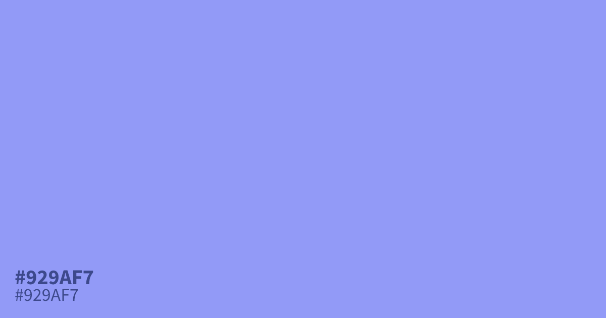
Periwinkle (#929af7) sits between blue and violet on the wheel, carrying a calm, restful character that reads as gentle rather than bold. Its psychology centers on quietness, softness, and openness, which is why designers often reach for it in wellness interfaces, meditation apps, and any context where a softer emotional tone matters.
Questions about #929af7
What is #929af7 in RGB, HSL and CMYK?
In RGB, #929af7 is rgb(146, 154, 247), in HSL hsl(235, 86%, 77%) and in CMYK 41%, 38%, 0%, 3%. Browse more shades of purple with names and hex codes.
What emotions does periwinkle evoke?
Calm, nostalgia, gentleness, and quiet friendliness. It is less stimulating than pure blue and often reads as approachable and tender.
When should I use periwinkle in a design?
Use it as a background or accent where the goal is relaxation: wellness apps, calming dashboards, springtime branding, or soft callout sections.
What text color works best on a periwinkle background?
Dark charcoal or deep navy text gives strong contrast and keeps the layout accessible. Pure white can feel washed out on this lightness level.
Is #929af7 readable on white or black?
#929af7 has a 2.56:1 contrast ratio on white and 8.18:1 on black. WCAG asks for 4.5:1 for body text and 3:1 for large text, so on white it is too faint for text and on black it works for body text. Try other pairs in the contrast checker.