
#8DA1C3 Hex Color
Dusty pastel blue, softened by gray
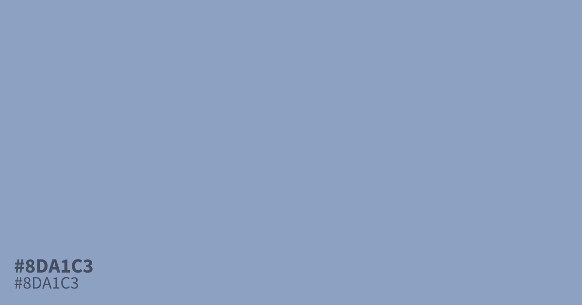
#8da1c3 is a dusty pastel blue with a clear gray undertone. Its low saturation keeps things muted, so it works best as a soft background or supporting tone rather than a bold accent. Pair it with terracotta or cream for gentle contrast, and note that black text reads clearly on it at about 8:1.
Questions about #8da1c3
What is #8da1c3 in RGB, HSL and CMYK?
In RGB, #8da1c3 is rgb(141, 161, 195), in HSL hsl(218, 31%, 66%) and in CMYK 28%, 17%, 0%, 24%. Browse more shades of blue with names and hex codes.
What colors pair well with #8da1c3?
Warm earth tones flatter it best. Try terracotta, soft cream, or muted burgundy against #8da1c3 for gentle contrast. Cool grays and navy also work, but they can flatten its softness.
Can white text sit on #8da1c3?
Not for body text. White on #8da1c3 gives about 2.6:1 contrast, below the 4.5:1 WCAG AA threshold. Black text reaches roughly 8:1, so dark text is the safer choice.
Is #8da1c3 readable on white or black?
#8da1c3 has a 2.61:1 contrast ratio on white and 8.01:1 on black. WCAG asks for 4.5:1 for body text and 3:1 for large text, so on white it is too faint for text and on black it works for body text. Try other pairs in the contrast checker.