
#8C698C Hex Color
A grounded and sophisticated dusty violet
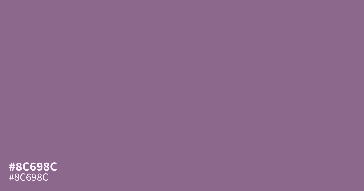
This dusty, muted violet feels grounded and mature due to its low saturation. Because it sits comfortably between gray and purple, #8c698c serves as a steady, sophisticated neutral rather than a loud statement color. It performs best as a supporting element or UI background, where white text remains readable against its surface. Pair it with soft cream or slate for a balanced, modern palette.
Questions about #8c698c
What is #8c698c in RGB, HSL and CMYK?
In RGB, #8c698c is rgb(140, 105, 140), in HSL hsl(300, 14%, 48%) and in CMYK 0%, 25%, 0%, 45%. Browse more shades of purple with names and hex codes.
What colors pair well with #8c698c for a balanced palette?
Is #8c698c suitable for use as a background color in UI design?
Yes, #8c698c makes an excellent UI background because its low saturation prevents it from competing with foreground content. It provides enough visual interest to feel intentional while remaining neutral enough to ensure white text stays readable and accessible.
Is #8c698c readable on white or black?
#8c698c has a 4.65:1 contrast ratio on white and 4.51:1 on black. WCAG asks for 4.5:1 for body text and 3:1 for large text, so on white it works for body text and on black it works for body text. Try other pairs in the contrast checker.