
#8B251E Hex Color
Online color picker to view shades, tints, color codes, and complementary colors
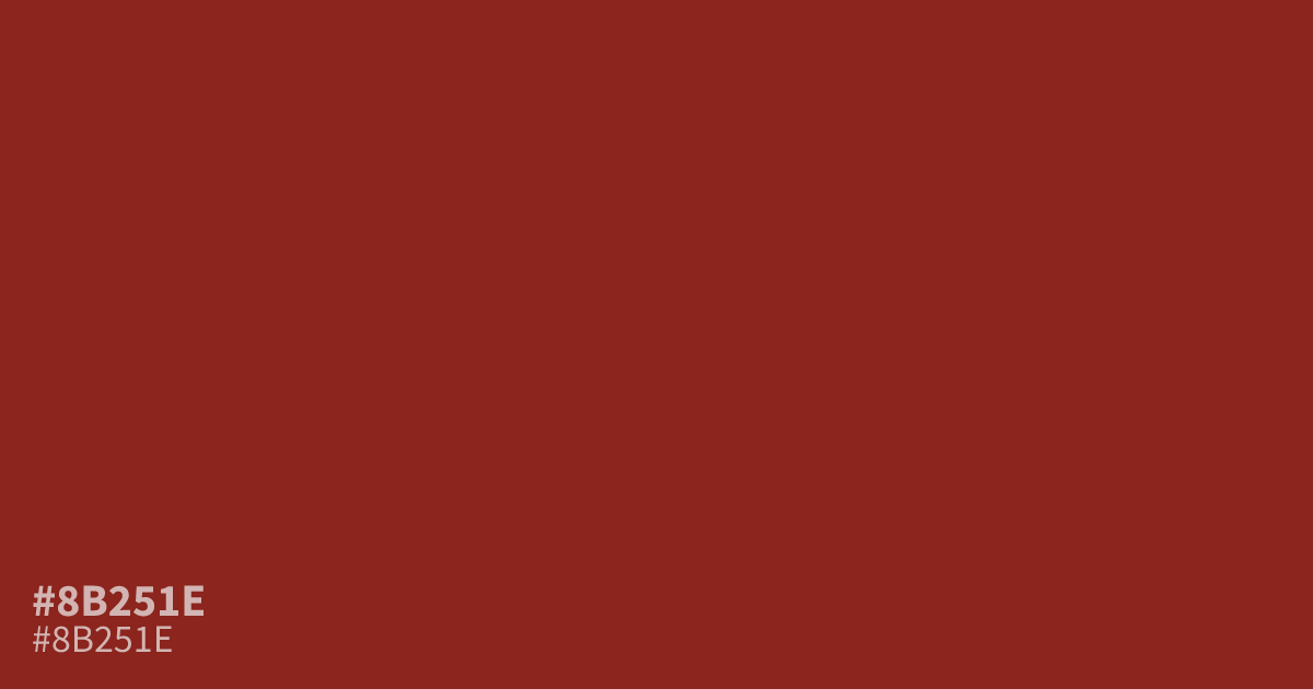
With its dark, muted red-brown undertones, #8b251e creates a serious, moody presence without feeling cold. The hex code #8b251e works well as a supporting tone for wine, sports, luxury, and autumn branding, especially beside warm cream or muted gold. Use white text for strong readability, including small body copy, with about an 8.8:1 contrast ratio.
Questions about #8b251e
What is #8b251e in RGB, HSL and CMYK?
In RGB, #8b251e is rgb(139, 37, 30), in HSL hsl(4, 64%, 33%) and in CMYK 0%, 73%, 78%, 45%. Browse more shades of brown with names and hex codes.
What colors pair well with #8b251e?
For pairings, #8b251e works well with warm cream, muted gold, and charcoal, because these tones balance its dark red-brown depth while preserving a warm, grounded palette for branding, packaging, and seasonal layouts. Use cream for softer contrast and gold for richer accents.
What mood does #8b251e create?
#8b251e conveys a serious, moody character with grounded warmth, making it useful when a design needs depth and confidence without the stark, cold feel of a near-black neutral or the brightness of a true red. It suits wine, sports, luxury, and autumn-inspired themes.
Does white text work well on #8b251e?
White text has strong contrast on #8b251e, making it a practical choice for headings, labels, and body copy when the type is sized and spaced appropriately for the surrounding layout. Check the final text-background combination with a contrast tool before publishing.
Is #8b251e readable on white or black?
#8b251e has a 8.81:1 contrast ratio on white and 2.38:1 on black. WCAG asks for 4.5:1 for body text and 3:1 for large text, so on white it works for body text and on black it is too faint for text. Try other pairs in the contrast checker.