
#8AD68F Hex Color
A breezy and light pastel green
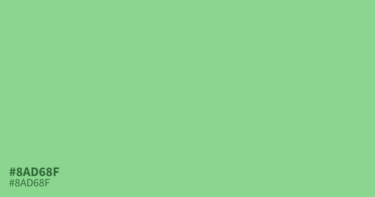
This pastel green is light, desaturated, and feels surprisingly airy. Because it sits on the brighter end of the spectrum, #8ad68f works best as a supporting tone rather than a dominant base. It pairs effectively with deep charcoal or warm slate grays for contrast. While accessible for body text, it shines brightest in UI backgrounds for wellness or organic brands needing a clean, soft aesthetic.
Questions about #8ad68f
What is #8ad68f in RGB, HSL and CMYK?
In RGB, #8ad68f is rgb(138, 214, 143), in HSL hsl(124, 48%, 69%) and in CMYK 36%, 0%, 33%, 16%. Browse more shades of green with names and hex codes.
What colors pair well with the #8ad68f hex color?
#8ad68f works best when balanced against deeper, grounded neutrals that prevent it from looking washed out. Try using a charcoal or a slate gray to provide a strong visual anchor that allows the airy green to breathe without losing its softness.
How should I use #8ad68f in UI design projects?
Apply #8ad68f as a supporting highlight rather than a base color to maintain high readability and visual hierarchy. It functions effectively for secondary buttons or subtle background accents, especially in wellness apps where a clean, approachable, and non-aggressive aesthetic is the primary goal.
Is #8ad68f readable on white or black?
#8ad68f has a 1.73:1 contrast ratio on white and 12.09:1 on black. WCAG asks for 4.5:1 for body text and 3:1 for large text, so on white it is too faint for text and on black it works for body text. Try other pairs in the contrast checker.