
#8A6870 Hex Color
Online color picker to view shades, tints, color codes, and complementary colors
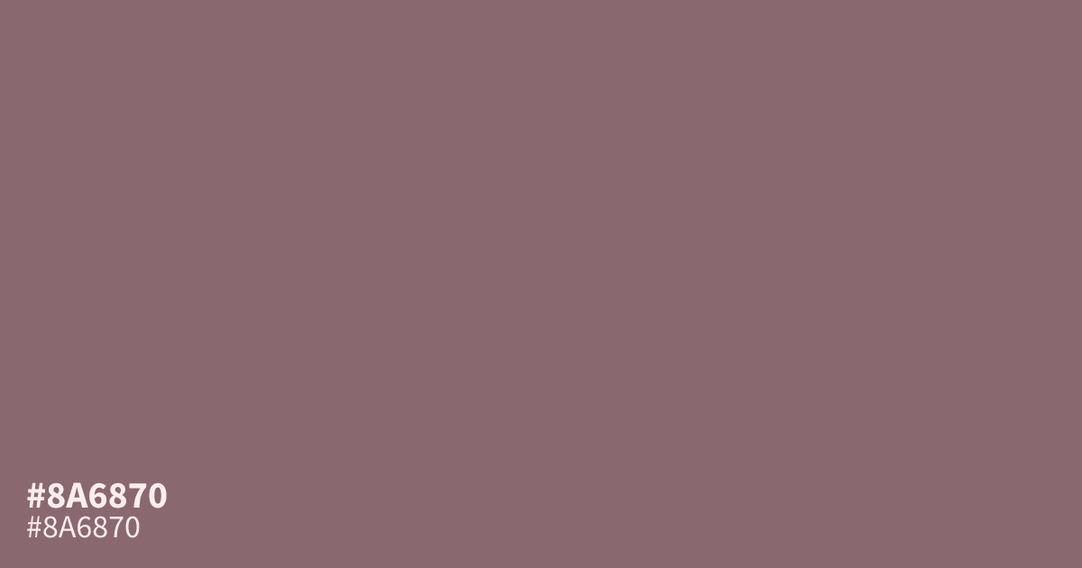
This muted, dusty pink carries an ashy undertone that feels understated and calm. Because it is highly desaturated, #8a6870 works best as a supporting tone rather than a large background. Pair it with soft charcoals or deep creams to maintain balance. It offers sufficient contrast for white text, making it a viable option for small, readable body copy in UI design.
Questions about #8a6870
What is #8a6870 in RGB, HSL and CMYK?
In RGB, #8a6870 is rgb(138, 104, 112), in HSL hsl(346, 14%, 47%) and in CMYK 0%, 25%, 19%, 46%. Browse more shades of pink with names and hex codes.
What colors pair best with #8a6870?
Because #8a6870 is a muted and desaturated tone, it works best when paired with neutral, high-contrast partners like deep charcoal or soft, creamy whites. These combinations ground the dusty pink without letting it overpower the overall design palette.
Is #8a6870 a warm or cool color?
#8a6870 leans toward a warm, rose-based undertone, but its heavy desaturation gives it a neutral, ashy quality that avoids feeling overly vibrant. This balance makes it versatile for professional UI designs that require a gentle, calming presence.
Is #8a6870 readable on white or black?
#8a6870 has a 4.88:1 contrast ratio on white and 4.29:1 on black. WCAG asks for 4.5:1 for body text and 3:1 for large text, so on white it works for body text and on black it works only for large text (24px, or 18.5px bold). Try other pairs in the contrast checker.