
#8230B2 Hex Color
A bold purple with serious depth
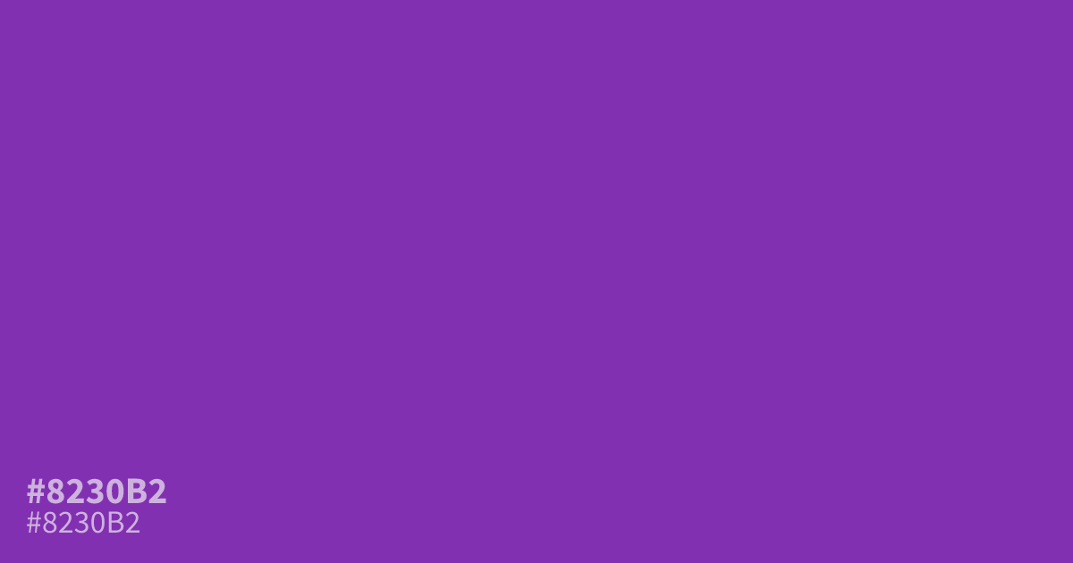
Reach for #8230b2 when a design needs a purple that holds its own. This shade is saturated and dark, so it reads bold without shouting, though full backgrounds can feel heavy. Use it as an accent, call-to-action, or highlight color. White text hits about 7.0:1 contrast on it, which passes AA for small type. Pair it with warm gold for punch.
Questions about #8230b2
What is #8230b2 in RGB, HSL and CMYK?
In RGB, #8230b2 is rgb(130, 48, 178), in HSL hsl(278, 58%, 44%) and in CMYK 27%, 73%, 0%, 30%. Browse more shades of purple with names and hex codes.
What text color should I use on #8230b2?
White text is the safe choice, with roughly 7.0:1 contrast that clears WCAG AA for small body text. Dark text on this purple fails contrast, so keep type light.
What colors pair well with #8230b2?
Warm gold and chartreuse bring out its electric side, while teal cools it into something more composed. Both work better than the pastel pinks designers usually reach for with purple.
Is #8230b2 readable on white or black?
#8230b2 has a 6.96:1 contrast ratio on white and 3.01:1 on black. WCAG asks for 4.5:1 for body text and 3:1 for large text, so on white it works for body text and on black it works only for large text (24px, or 18.5px bold). Try other pairs in the contrast checker.