
#80B0FF Hex Color
Online color picker to view shades, tints, color codes, and complementary colors
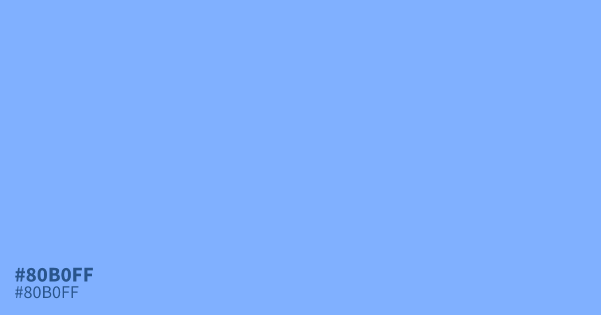
Close to a clear morning sky, #80b0ff is a pastel blue with high lightness and a faint violet undertone. It stays fresh and sparkling rather than heavy. Use it as a dominant background in spring, healthcare, or app UI work; black text passes AA comfortably at about 9.6:1 contrast. It reads brighter than mixing gray into a base blue, and white type washes out on it.
Questions about #80b0ff
What is #80b0ff in RGB, HSL and CMYK?
In RGB, #80b0ff is rgb(128, 176, 255), in HSL hsl(217, 100%, 75%) and in CMYK 50%, 31%, 0%, 0%. Browse more shades of blue with names and hex codes.
What text color should I use on #80b0ff?
Black text. It reaches about 9.6:1 contrast, well past the 4.5:1 AA requirement for small body text. White text drops far below that ratio, so keep light type off it except for large decorative headlines.
What colors pair well with #80b0ff?
Deep navy grounds its lightness, while coral or terracotta adds warm contrast without clashing. For softer palettes, try sage or warm gray so the blue keeps its fresh, cool character.
Is #80b0ff readable on white or black?
#80b0ff has a 2.19:1 contrast ratio on white and 9.57:1 on black. WCAG asks for 4.5:1 for body text and 3:1 for large text, so on white it is too faint for text and on black it works for body text. Try other pairs in the contrast checker.