
#801C3C Hex Color
Online color picker to view shades, tints, color codes, and complementary colors
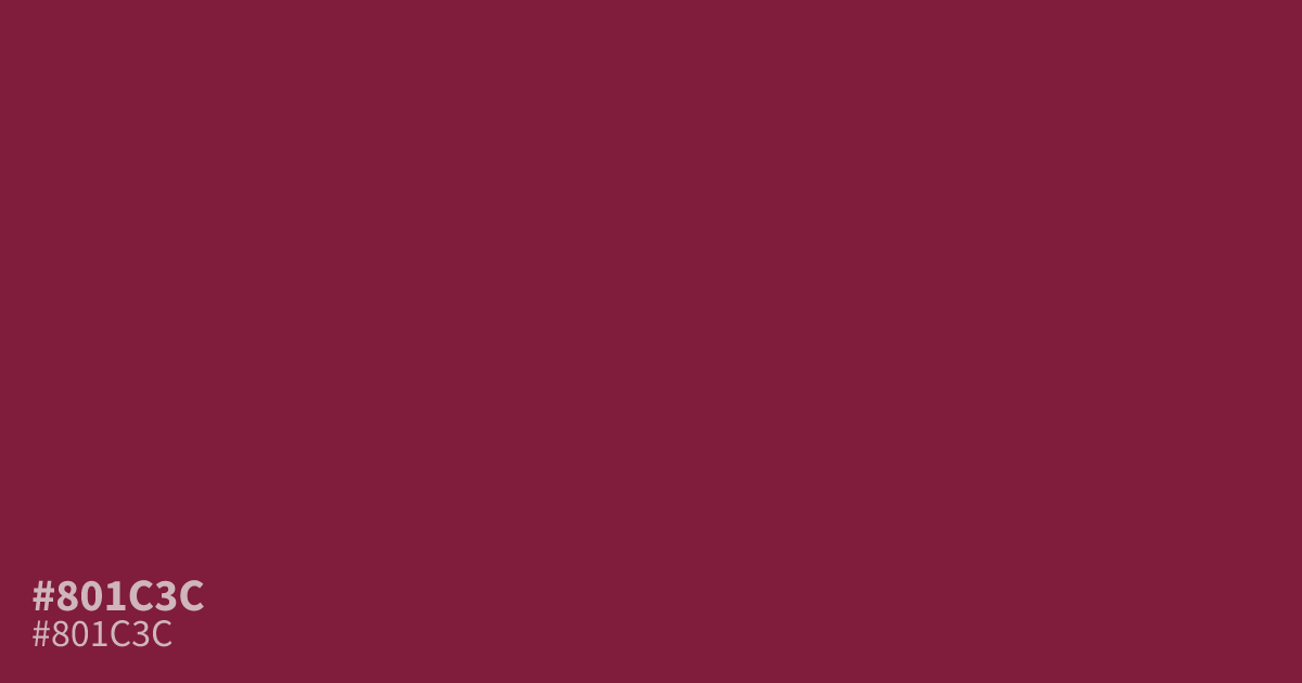
This deep, moody crimson carries a heavy, saturated presence that leans toward maroon. With its intense dark undertones, #801c3c works best as a primary accent color rather than a large-scale background. It provides excellent contrast for white text, making it a functional choice for bold typography or luxury branding elements. Avoid overusing it in confined spaces, as its density can quickly overwhelm a design palette.
Questions about #801c3c
What is #801c3c in RGB, HSL and CMYK?
In RGB, #801c3c is rgb(128, 28, 60), in HSL hsl(341, 64%, 31%) and in CMYK 0%, 78%, 53%, 50%. Browse more shades of pink with names and hex codes.
What is the best way to use #801c3c in a design?
#801c3c functions best as an impactful accent or a bold call-to-action button rather than a primary background color. Due to its high density and saturated nature, it draws immediate attention without overwhelming the viewer when used in small, deliberate doses.
Which colors pair well with #801c3c for a balanced palette?
Is #801c3c readable on white or black?
#801c3c has a 9.77:1 contrast ratio on white and 2.14:1 on black. WCAG asks for 4.5:1 for body text and 3:1 for large text, so on white it works for body text and on black it is too faint for text. Try other pairs in the contrast checker.