
#7F1542 Hex Color
Online color picker to view shades, tints, color codes, and complementary colors
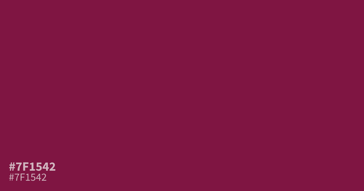
This dark, muted berry tone feels serious and moody, steering clear of typical bright pinks. Because #7f1542 is quite saturated and heavy, it works best as a bold accent or a grounded background for nightlife or cosmetic branding. It offers enough contrast for white text to remain readable. Pair it with soft, warm grays to balance its intense, romantic undertones without making the design feel overwhelming.
Questions about #7f1542
What is #7f1542 in RGB, HSL and CMYK?
In RGB, #7f1542 is rgb(127, 21, 66), in HSL hsl(335, 72%, 29%) and in CMYK 0%, 83%, 48%, 50%. Browse more shades of pink with names and hex codes.
Does #7f1542 work well as a background color?
#7f1542 functions best as a background when used sparingly in high-contrast environments like nightlife or luxury branding. Because it is quite dark and heavy, ensure your primary text is set in a crisp white or very light cream to maintain readability.
What colors pair best with #7f1542 for balance?
To soften the intensity of #7f1542, pair it with muted, neutral tones like soft gray or a warm taupe. These neutrals prevent the deep berry from feeling overwhelming while highlighting its romantic, sophisticated undertones.
Is #7f1542 readable on white or black?
#7f1542 has a 10.05:1 contrast ratio on white and 2.08:1 on black. WCAG asks for 4.5:1 for body text and 3:1 for large text, so on white it works for body text and on black it is too faint for text. Try other pairs in the contrast checker.