
#7E613D Hex Color
Online color picker to view shades, tints, color codes, and complementary colors
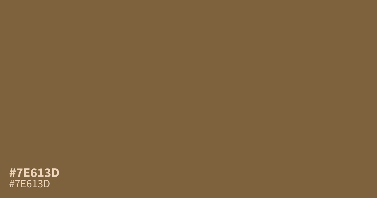
#7e613d is a muted, medium-dark orange-brown with dusty gray undertones. Its low saturation creates a mellow, weathered feel suited to coffee, chocolate, leather, agriculture, and autumn branding. Use it as a supporting tone with cream or muted teal. White text provides about 5.7:1 contrast, making it suitable for accessible body copy. The hex code is #7e613d.
Questions about #7e613d
What is #7e613d in RGB, HSL and CMYK?
In RGB, #7e613d is rgb(126, 97, 61), in HSL hsl(33, 35%, 37%) and in CMYK 0%, 23%, 52%, 51%. Browse more shades of brown with names and hex codes.
What colors pair well with #7e613d?
Muted teal, cream, and soft warm neutrals pair well with #7e613d, balancing its earthy orange-brown base while preserving its subdued character without making the palette feel harsh, overly bright, or busy. Use cream for gentle contrast, or choose muted teal for a cooler accent in branding and editorial layouts.
Is #7e613d a warm or cool color?
#7e613d reads as a warm, muted brown because its orange base brings earthy heat, while dusty gray undertones soften the saturation and keep the warmth restrained for a calm visual presence. It feels weathered and grounded rather than bright or fiery, making it useful for calm, tactile visual systems.
Does #7e613d work with white text?
#7e613d provides about a 5.7:1 contrast ratio with white, which meets WCAG AA for normal text and supports readable body copy and interface labels on dark brown backgrounds in most design contexts. Check overlays, gradients, and transparency separately because they can change the final contrast.
Is #7e613d readable on white or black?
#7e613d has a 5.73:1 contrast ratio on white and 3.66:1 on black. WCAG asks for 4.5:1 for body text and 3:1 for large text, so on white it works for body text and on black it works only for large text (24px, or 18.5px bold). Try other pairs in the contrast checker.