
#7E27C3 Hex Color
Online color picker to view shades, tints, color codes, and complementary colors
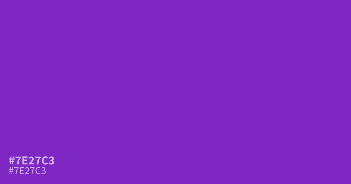
This highly saturated violet demands immediate attention. Due to its intensity, #7e27c3 is best reserved as a 10% accent color rather than a primary background. It pairs exceptionally well with muted grays or sharp lime greens, creating a modern, high-contrast look. Because white text maintains a clear 7.1:1 contrast against this hex code, it works effectively for bold buttons or striking graphical callouts.
Questions about #7e27c3
What is #7e27c3 in RGB, HSL and CMYK?
In RGB, #7e27c3 is rgb(126, 39, 195), in HSL hsl(273, 67%, 46%) and in CMYK 35%, 80%, 0%, 24%. Browse more shades of purple with names and hex codes.
What colors pair well with #7e27c3 for a modern palette?
Because #7e27c3 is so intense, pairing it with muted charcoal or soft gray creates a balanced, professional look. For a high-contrast, energetic vibe, use it alongside sharp lime greens or complementary yellow-oranges to really make the violet pop.
Can #7e27c3 be used as a primary background color?
It is generally not recommended to use #7e27c3 as a full-page background because its high saturation can quickly overwhelm the viewer. Instead, reserve this bold shade for buttons, callouts, or small graphical elements where you need to draw immediate attention.
Is #7e27c3 readable on white or black?
#7e27c3 has a 7.08:1 contrast ratio on white and 2.96:1 on black. WCAG asks for 4.5:1 for body text and 3:1 for large text, so on white it works for body text and on black it is too faint for text. Try other pairs in the contrast checker.