
#7D7A9C Hex Color
Online color picker to view shades, tints, color codes, and complementary colors
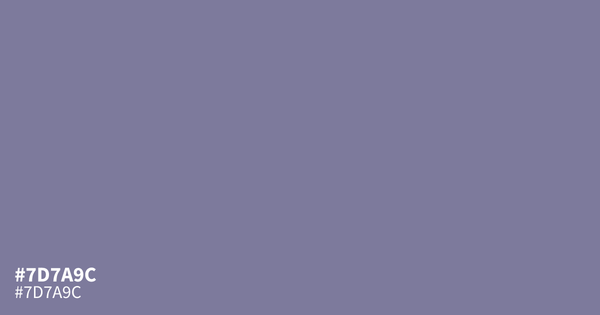
This muted, dusty violet feels serious and understated. Because it is highly unsaturated, #7d7a9c functions best as a supporting background rather than a main focal point. It pairs well with cream or muted terracotta to soften the cool, ashy undertones. Since it offers strong contrast for readability, designers often use this hex code for UI elements that require clarity alongside a calm, professional aesthetic.
Questions about #7d7a9c
What is #7d7a9c in RGB, HSL and CMYK?
In RGB, #7d7a9c is rgb(125, 122, 156), in HSL hsl(245, 15%, 55%) and in CMYK 20%, 22%, 0%, 39%. Browse more shades of purple with names and hex codes.
What color combinations work best with #7d7a9c?
Because #7d7a9c carries cool, ashy undertones, it balances beautifully when paired with warm neutrals like cream or muted terracotta. These pairings soften the violet's inherent seriousness while maintaining the high contrast needed for effective UI design and accessible typography.
Is #7d7a9c a good choice for UI background elements?
Yes, the high level of desaturation in #7d7a9c makes it an excellent choice for a neutral, non-distracting background. It provides strong readability for standard text elements while offering a more sophisticated, professional aesthetic than a standard flat gray or off-white background.
Is #7d7a9c readable on white or black?
#7d7a9c has a 4.08:1 contrast ratio on white and 5.13:1 on black. WCAG asks for 4.5:1 for body text and 3:1 for large text, so on white it works only for large text (24px, or 18.5px bold) and on black it works for body text. Try other pairs in the contrast checker.